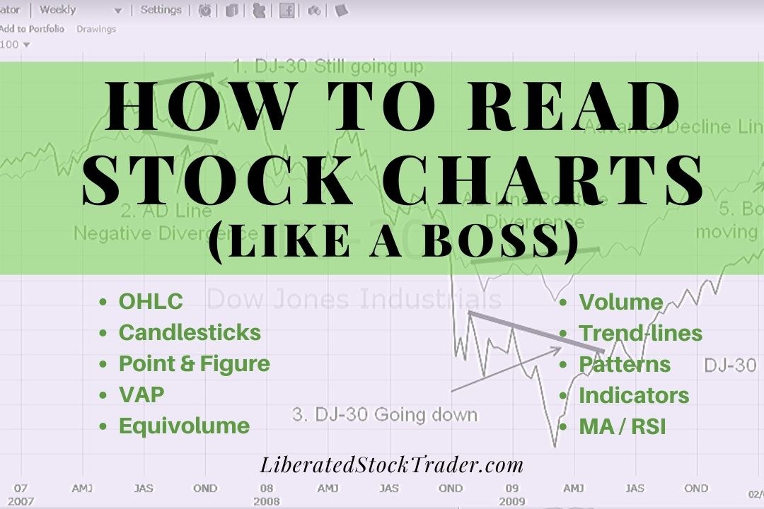
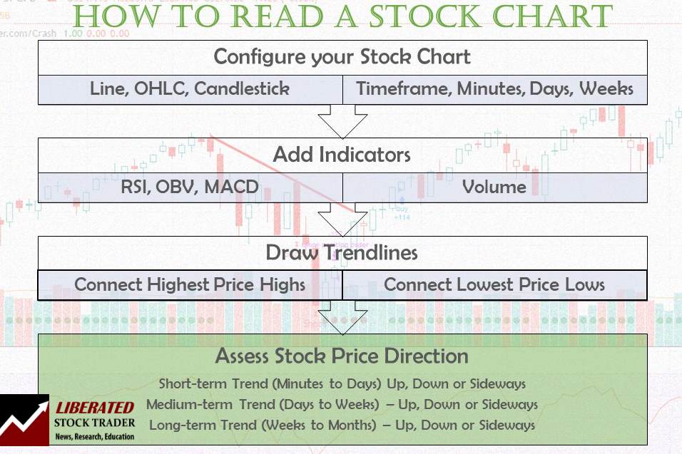
To read stock charts, you need to use stock charting software, select your chart type, configure your timeframe, determine price direction using trendlines, and use indicators to estimate future prices.
That may sound difficult, but as a technical analyst with IFTA, I am certified to read stock charts and am here to help you learn. I hope you enjoy this in-depth definitive guide to reading and understanding stock charts, patterns, and indicators.
What is a Stock Chart?
A stock chart visually represents current and historical stock prices on an X- and Y-axis. It shows a company’s past and recent stock price performance. Volume and price indicators are significant to stock charts, as are the ability to see historical price patterns and trends to predict future price movement.
To understand stock charts, you must know how supply and demand work in a marketplace. The volume indicator and the stock price movement are the critical elements in effectively interpreting stock charts. For example, when the price rises on increased trading volume, you can expect the price to continue higher.
The volume, supply, and demand section will cover all of this.
How to Read a Stock Chart in 7 Easy Steps
1. Open a Stock Chart
You can read stock charts using stock charting software that performs the data collection and calculations for you. You must understand stock prices, timeframes, supply and demand, chart patterns, volumes, and how stock chart indicators are calculated. This guide covers the eight stock chart types, indicators & patterns.
To quickly open a stock chart for free and without registration, try TradingView.
This section is all about understanding a basic stock chart. Known as technical analysis or stock chart analysis, chart reading enables us to visualize a stock not through numbers but through patterns. It allows us to see the stock and its history, learn its personality, and judge its future. Before learning to read charts, you might want to select charting software that is perfect for beginners.
We will start with a basic price chart, move on to technical indicators, and assess their importance and meaning in future sessions.
2. Select a Chart Type
Stock charts come in many shapes and sizes, from the differences in the bars to the different concepts applied to the chart itself. Here, you will find a quick reference guide to the many types of charts available with an overview of their potential uses. Click here for an in-depth guide to stock chart types.
OHLC Charts
For the more traditional traders, OHLC charts can also be used to analyze patterns and price trends. These bar charts show a given security’s opening, high, low, and closing prices over a specified period. While they don’t have the same level of detail as candlestick charts, they still provide useful information for traders looking for entry and exit points.
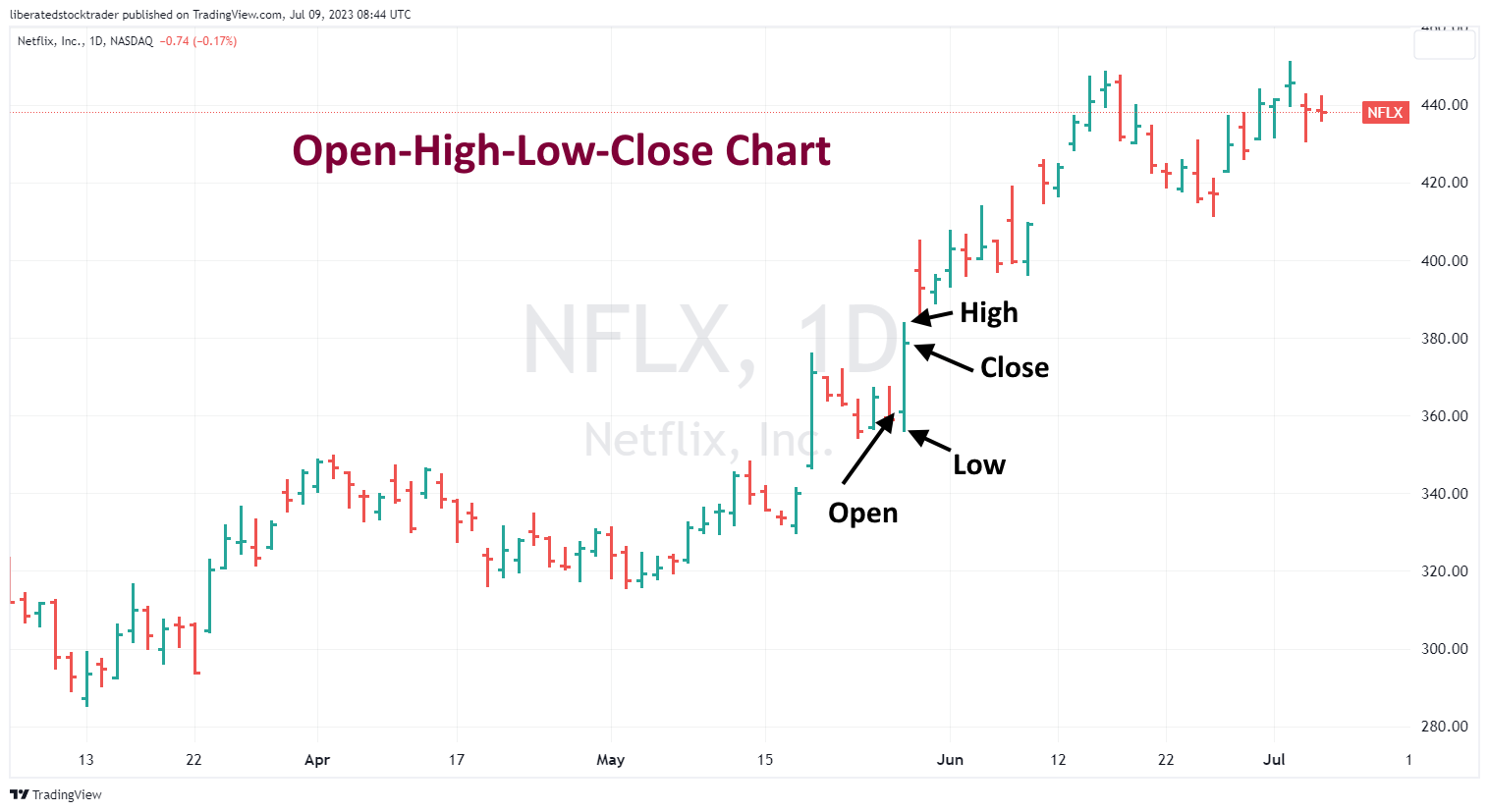
Get OHLC Charts on TradingView for Free
When trading with OHLC charts, traders should look for patterns that indicate a trend. Common patterns to look for include breakouts, flags, pennants, double bottoms, and cup and handle patterns. By analyzing these patterns, traders can identify market entry and exit points. Traders should also pay close attention to support and resistance levels, as they can provide useful information on the strength of a trend. Additionally, traders should be aware of any news or economic events that could affect the traded security.
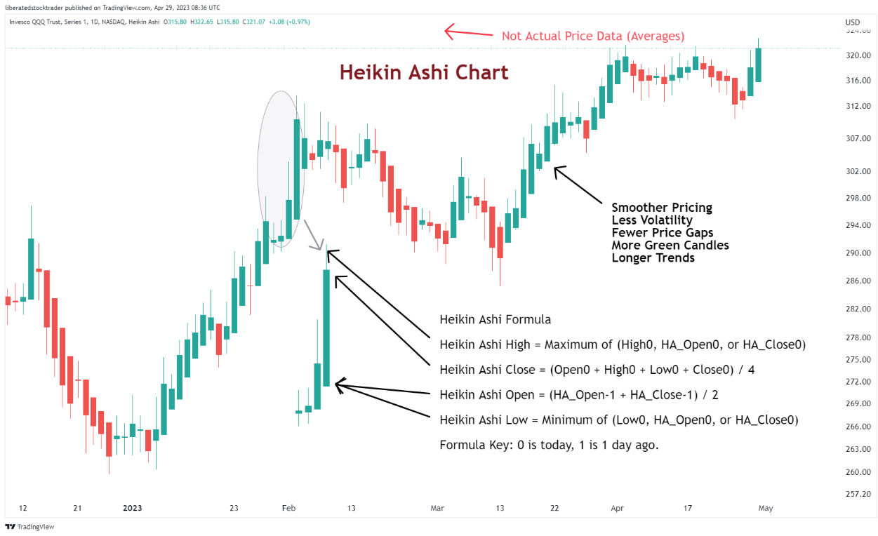
Heikin Ashi Charts
According to our testing, Heikin Ashi (HA) charts are the best-performing charts. They factor in recent price action to create more reliable and accurate data points than regular candlestick charts. This makes them ideal for traders who need to identify potential trading signals and long-term investors who want to confirm their investment strategies.
Heikin Ashi combines candlestick charting and price averaging to create an enhanced visual representation of trends. Essentially, Heikin Ashi smooths out daily volatility to unveil actionable price trends, making it a superior chart for developing trading strategies.
Get Heikin Ashi Charts on TradingView for Free
Heikin Ashi candles are a relatively recent approach to trading stocks and other financial assets. Although they have existed since the 1600s, their popularity has surged only recently due to their capacity to provide traders with more accurate trend data.
Heikin Ashi charts can identify support and resistance levels, recognize trading signals, and determine potential entry and exit points. Additionally, Heikin Ashi candles allow for measuring momentum, volatility, and volume, providing a comprehensive overview of the market’s behavior.
Our backtesting of Heikin Ashi charts shows that it beat buy-and-hold strategies with a 60% success rate versus 10% for standard OHLC bars and candlesticks.
The most important factor when reading Heikin Ashi charts is identifying the trend. By looking at the color of each candle, traders can determine whether the price is trending upwards or downwards. If a succession of candles has colors consistent with an uptrend (i.e., all green), then it is likely that the price will continue to go up in the coming days. If, however, the colors are red, then it is likely that the price will continue to go down.
My thorough testing awarded TradingView a stellar 4.8 stars!
With powerful stock chart analysis, pattern recognition, screening, backtesting, and a 20+ million user community, it’s a game-changer for traders.
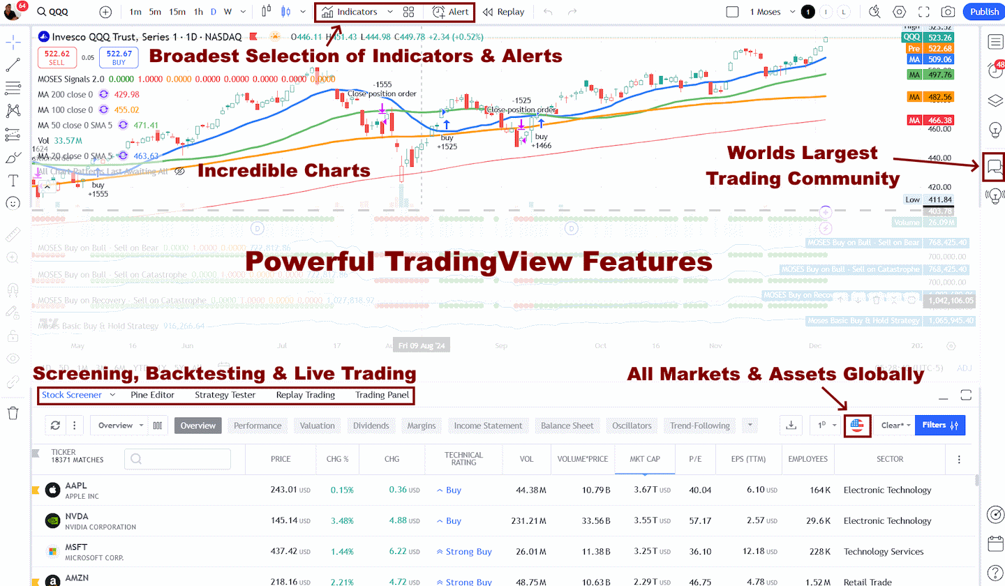
Whether you're trading in the US or internationally, TradingView is my top pick for its unmatched features and ease of use.
Explore TradingView – Your Gateway to Smarter Trading!
Once a trend has been identified, traders can use Heikin Ashi candles to spot support, resistance levels, and trading signals, which help them make better decisions when entering or exiting a trade.
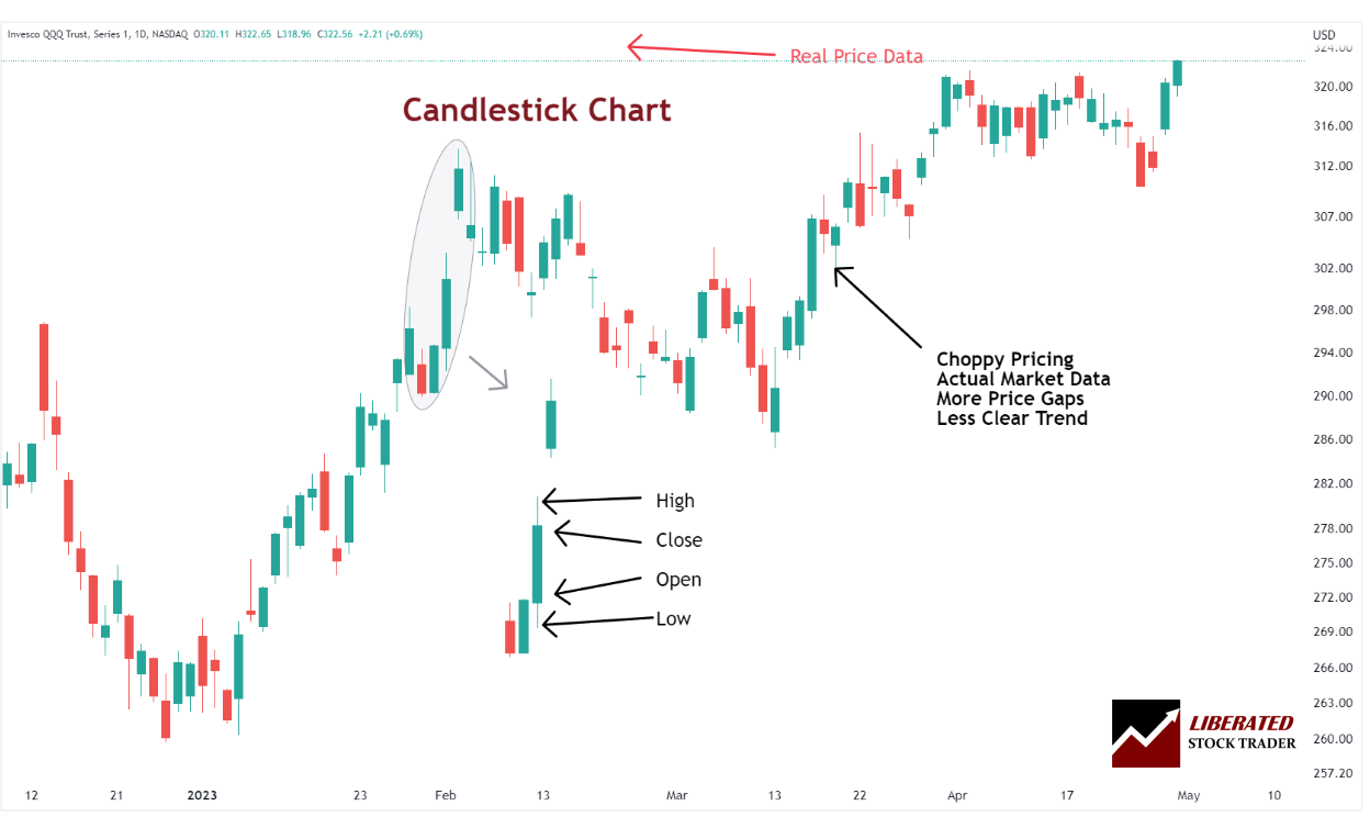
Japanese Candlestick Charts
Japanese Candlestick charts originated in the 1700s when rice traders in Japan began using them to predict and track price movements. They provide a graphic representation of price data over time. They comprise a body (the area between the open and close price) and shadows (the area above or below the body).
The key benefit of using candlestick charts is that they allow traders to quickly identify potential patterns in the market, which can help them decide when to enter or exit a trade. For example, if a pattern appears where the upper shadow is consistently larger than the lower shadow, then this could indicate that buying pressure is increasing.
On the other hand, if there is consistently more selling pressure than buying pressure, it might be time for traders to exit their positions. By combining pattern recognition with support/resistance levels identified from candles, traders can make informed decisions about when to buy or sell within their trading strategy.
Japanese Candlestick patterns are a powerful tool many traders use to identify trends and potential reversal points in the market. The ability to see these candlestick patterns can help traders identify important support/resistance levels or attempt to predict what direction the price may go next. By combining technical analysis with fundamental analysis and news events, traders can get an edge over the markets. However, it is important to remember that no system or method is perfect, and you should always use sound risk management when trading and properly backtest any trading strategy. With proper practice, traders can use candlestick patterns to their advantage and generate consistent profits.
How many candlestick patterns are there?
There are over 200 candlestick patterns; some commonly used ones include Engulfing, Bearish Harami, Bullish Harami, Doji, and the highly profitable Inverted Hammer and Marubozu. Each pattern has its unique characteristics that can be used to identify potential trading opportunities. It is important to note that the interpretation of each pattern may vary depending on the timeframe being used. Additionally, some patterns may be more reliable than others. As a trader, it is important to understand the nuances of each pattern and how they can be applied in different market scenarios.
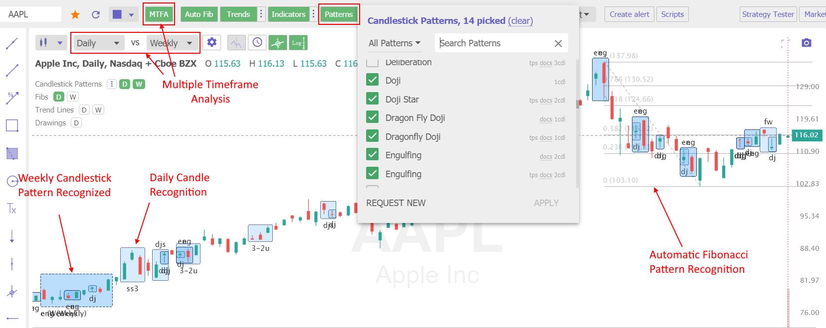
Use Candlestick Pattern Recognition
The problem with candlestick patterns is there are so many to remember, and it is time-consuming to identify them accurately. That is where software like TradingView and TrendSpider can help.
TrendSpider is the only trading software that enables scanning and point-and-click backtesting of 230 candlestick patterns. It is a great place to start if you want to gain an edge in trading.
Get TrendSpider’s Pattern Recognition & Backtesting
TradingView includes intelligent candlestick pattern recognition for free, but you must learn pine script coding to perform any backtesting.
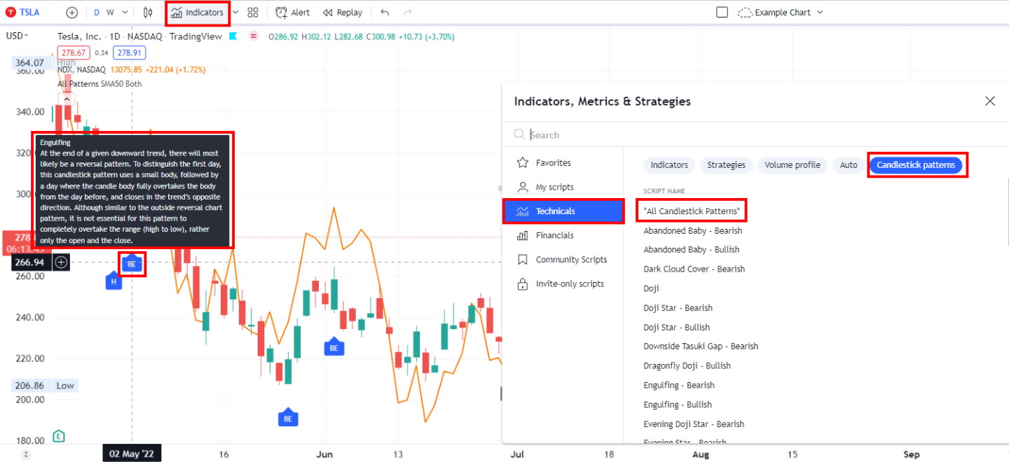
TradingView has powerful and intuitive candlestick chart pattern recognition.
Remember that candlestick patterns are only one tool among many regarding technical analysis. Combining other indicators and methods is important for a comprehensive approach to trading.
| Candlestick Software | TrendSpider | TradingView | MetaStock |
| Rating | ★★★★★ | ★★★★ | ★★★★ |
| Candlestick Patterns Recognized | 123 | 27 | 52 |
| Pricing | Included | Included | $349 add-on |
| Full Review | Read the Review | Read the Review | Read the Review |
Point & Figure Charts
Point & Figure charts (P&F) are composed of ‘Xs and ‘Os, representing price movements. When the prices increase, an ‘X’ is plotted on the chart, and an ‘O’ is plotted when they move down. These charts help traders identify support and resistance levels by plotting points that signify a reversal in the trend. P&F charts ignore time and volume, making them ideal for identifying long-term trends.
Each point on a P&F chart represents a set price movement (the box size). This eliminates noise and helps traders identify similar trends. For example, a box size of $5 would mean that each ‘X’ or ‘O’ represents the stock moving up or down by at least $5.
 Charts Explained")
Get P&F Charts on TradingView for Free
By studying Point & Figure charts, traders can identify resistance and support levels by looking for patterns of ‘Xs and ‘Os that indicate a potential reversal in price movement. They can also look for breakouts when prices move out of the pattern and continue in the opposite direction. This is often seen as an indication that the trend is changing and may be used as a signal for entering or exiting a position.
Point-and-figure charts can also help identify consolidation areas when prices move within a range without making any significant progress, either up or down. This type of charting allows traders to identify potential opportunities to enter or exit positions based on their analysis.
3. Choose a Chart Timeframe
Choosing a chart timeframe is another important factor when it comes to technical analysis. A longer-term chart may be better for longer-term trades, while a shorter-term chart may be more suitable for short-term trades. Different traders will have different preferences and strategies when selecting an appropriate timeframe, so it’s important to experiment with various charts and timeframes until you find one that works best for you. By analyzing different timeframes, traders can also identify trends that could provide clues as to the direction of future price movements. Additionally, traders may be able to differentiate between short-term and long-term support and resistance levels, which could provide insight into potential trading opportunities.
Core Elements of a Stock Chart
- Ticker & Company Name: What company stock price are you looking at
- Chart Type: What chart are you using, Bar, Line, or Candlestick?
- Time Frames: Daily, Weekly, Monthly, or Yearly
- Chart Scaling: What scale is price using, Percent, Fixed, Algorithmic, or Logarithmic
- Price Bars: Indicate the Open, High, Low, and Close of the Price for the day
Ticker & Company Name
The ticker (INTC) is the unique abbreviated stock reference code; all stocks have a unique Ticker to be easily found and referenced.
Time Frames
Timeframes are always plotted along the chart’s bottom and can be anything from 1 minute per bar (intraday) to 1 year per bar. This chart shows a Daily chart, which means each bar equals one day.
Chart Scaling
Logarithmic, arithmetic, and percent are the most common chart scaling choices. The scale on the vertical axis indicates how much each bar movement equals. Logarithmic scaling means each bar movement is greater the further up the chart you go. Percent scaling means each bar move is a percentage of the total price movement for that period. The arithmetic scale (the default) draws each tick in equal increments regardless of how much price moved.
4. Use Trendlines
To read a stock chart, you need to draw a trendline on the price pattern; this helps you assess the direction of the stock price.
What is a Stock Price Trend?
If someone asked you today, “Is the stock market in an uptrend, downtrend, or a lateral consolidation,” what would you answer? Knowing the answer to this key question is important for the stock market or even an individual stock. Why?
If you buy a stock (go long) in an uptrend, you will likely make money on it. There is a simple way to see if the market is heading upwards or downwards.
First, let’s examine what types of trends exist:
3 Types of stock price trends:
- Uptrend: The stock or index is moving up, making new highs or higher highs
- Downtrend: The stock or index is moving downwards, making lower lows
- Sideways consolidation: neither making significant new highs nor new lows
Timeframes must also be considered when evaluating a trend; for this, we will refer to Charles Dow’s classification in Dow Theory.
Types of Stock Trend Timeframes:
- Short Term: Days to weeks
- Medium Term: Weeks to months
- Long Term: Months to years
You could be specific about the market trend by combining the above terms. For example, you could say the market is in a short-term up-trend but a long-term down-trend. But isn’t that contradictory, the market being both an uptrend and a downtrend simultaneously?
Investing In Stocks Can Be Complicated, Stock Rover Makes It Easy.
Stock Rover is our #1 rated stock investing tool for:
★ Growth Investing - With industry Leading Research Reports ★
★ Value Investing - Find Value Stocks Using Warren Buffett's Strategies ★
★ Income Investing - Harvest Safe Regular Dividends from Stocks ★

"I have been researching and investing in stocks for 20 years! I now manage all my stock investments using Stock Rover." Barry D. Moore - Founder: LiberatedStockTrader.com
How to Draw Trendlines on the Stock Price
Drawing trendlines is one of the most important skills of technical analysts; trendlines represent important areas of support and resistance. Once you have this skill, charts come to life and start to signal their message to you.
Video: How To Draw Trendlines
Please excuse the sound quality – it was a live broadcast.
3 Steps to Drawing Your First Trendlines
1. Drawing Uptrends
- To evaluate an upward trend, draw a line joining the highest highs.
- Draw a line connecting the lowest lows for the floor of the uptrend. The price bounces three times off the bottom line but proceeds higher.
- A trendline is drawn to show that the price has moved strongly past the previous high; this is a BUY Signal at $35.50.
- Finally, the price is exhausted and falls through the bottom resistance line at $51. This break of the upward support line is a sell signal.

Quick Tip: The more bounces off a trendline the stronger the trend.
Based on the trendlines, buying and selling would have bagged you a 49% win. Life is never easy, and showing this retrospectively means we benefit from hindsight.
2. Drawing Support & Resistance Trendlines
It would be best to practice drawing trendlines as much as possible; after a while, you will get used to it, and it will become second nature.
Here is another example of how to draw trendlines. This is a chart of Ticker: AAPL Apple Inc. It shows how to draw trendlines in a downward and upward price move.

Notice that the trendline above the price is called resistance, and the trendline below the price is called support. When the price breaks up through resistance, it moves higher; this could be a buy signal. When the price breaks down through the support trendline, it moves lower; this could potentially be a sell signal.
Quick Tip: The longer the trendline is in place or acts as support or resistance, the stronger the trend and the bigger the move when the trendline is broken.
Look again at Apple Inc.’s chart. See how Apple was in a sideways consolidation from 2001 through 2004. When it eventually broke out of that channel upwards through resistance, the stock took off, making over 1600% gain.
5. Identify Price Patterns
Traditionally, identifying chart patterns on a stock chart, drawing trendlines, and plotting target prices required manual effort. However, with the advent of TradingView, most chart patterns can now be automatically detected, streamlining the analysis process for professionals. TradingView is the number one charting service in the world and is loved by Liberated Stock Trader readers.
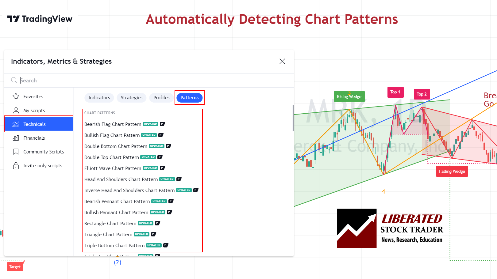
Get TradingView Chart Pattern Recognition for Stocks, Forex & Crypto Now
Video: Reliable & Profitable Chart Patterns
1. Inverse Head & Shoulders
An inverse head and shoulders stock chart pattern has an 89% success rate for a reversal of an existing downtrend. With an average price increase of 45%, this is one of the most reliable chart patterns.
The inverse head-and-shoulders pattern occurs when the price of a security hits the bottom three times, with two troughs forming the “shoulders” and the third lower trough forming the “head.” This pattern can indicate that the security’s price could soon begin to move higher.
| Chart Pattern | Success Rate | Average Price Change |
| Inverse Head and Shoulders | 89% | +45% |
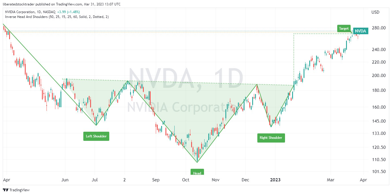
To identify an inverse head and shoulders pattern, look for three distinct lows in the security’s price on intraday, daily, and weekly charts. The middle low (head) should be significantly lower than the other shoulders. Look for a confirmation of a trend reversal by watching for a breakout either above the upper resistance line or below the lower support line.
If the security price breaks out above the resistance line, it could signal that the security has completed its reversal. In contrast, a break below the support line could signal a resumption of the downtrend.
2. Double Bottom – 88% Success
A double-bottom chart pattern has an 88% success rate on a reversal of an existing downtrend. When the price breaks through resistance, it has an average 50% price increase; the only pattern better than this is a cup and handle.
The double bottom occurs when the security price hits the bottom twice, creating a “W”-shaped pattern. This pattern often indicates that the stock’s price could soon increase. However, it should be noted that this indicator does not guarantee a reversal in direction.
| Chart Pattern | Success Rate | Average Price Change |
| Double Bottom | 88% | 50% |
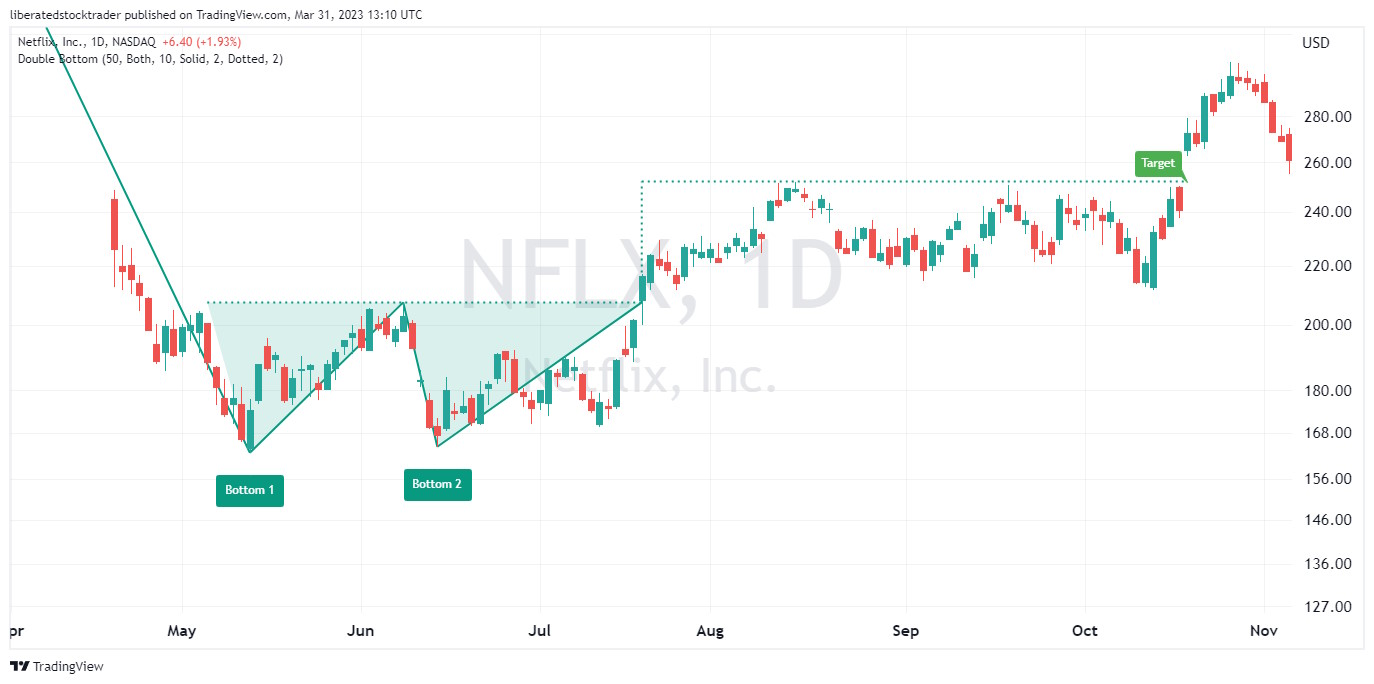
Auto-detect this Chart Pattern with TradingView
To identify a double bottom chart pattern, investors should look for two distinct lows in the security’s price that form a “W”-shaped pattern. Generally, the pattern should be visible on an intraday and daily chart. After identifying the two bottoms, investors can look for a confirmation of a trend reversal by watching for a breakout either above the upper resistance line or below the lower support line.
If the security price breaks out above the resistance line, it could signal that the security has completed its reversal. In contrast, a break below the support line could signal a resumption of the downtrend. It should be noted that further confirmation of this stock chart pattern should not be relied upon until after prices have moved beyond these levels.
3. Triple Bottom – 87% Success
A triple bottom chart pattern indicates the potential for a reversal of an existing downtrend with an 87% probability of success and an average 45% price increase.
A triple bottom occurs when the price hits the bottom three times, creating a “VVV”-shaped pattern. This pattern often indicates that the asset price could soon begin to increase.
| Chart Pattern | Success Rate | Average Price Change |
| Triple Bottom | 87% | 45% |
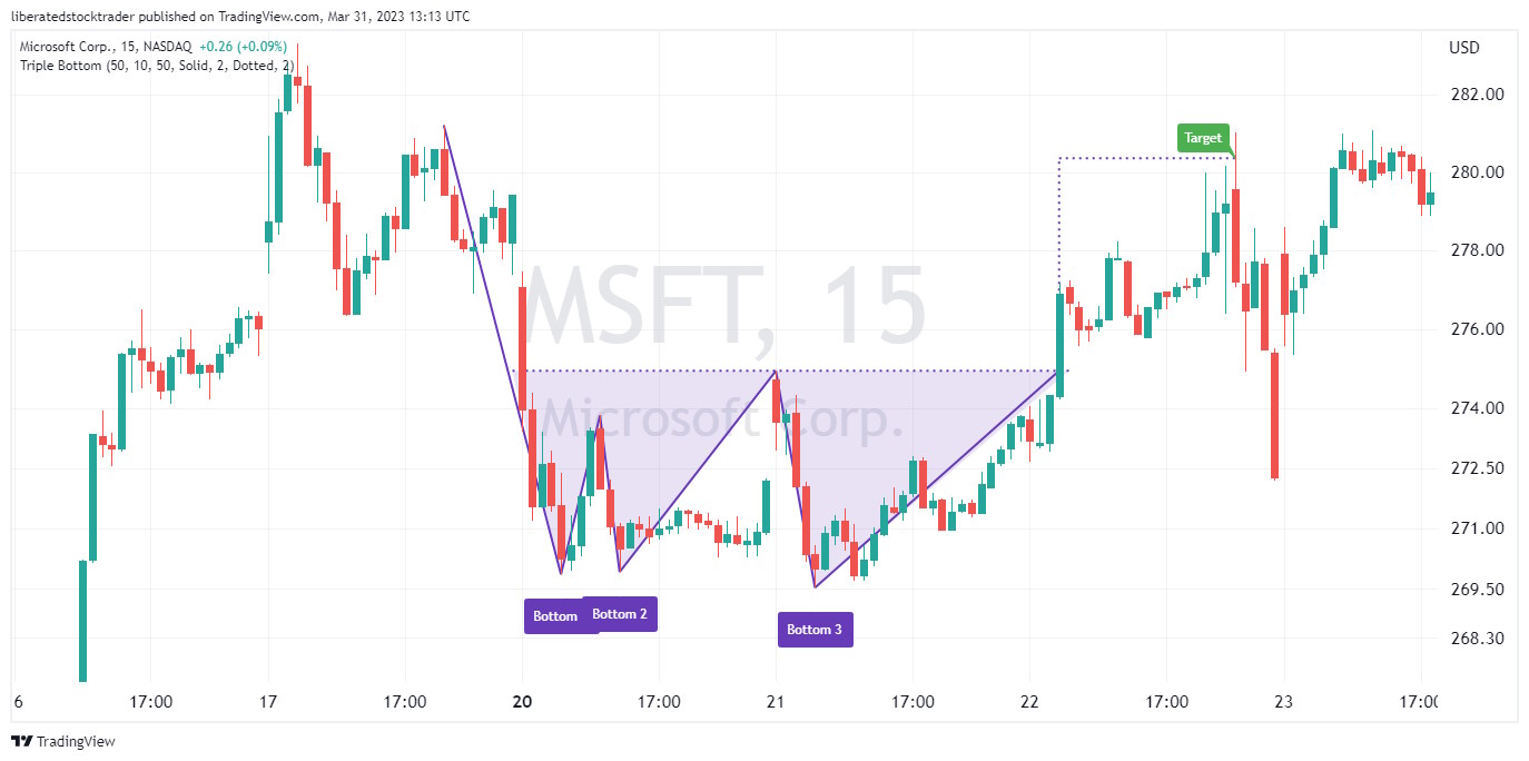
To identify this stock chart pattern, investors should look for three distinct lows in the security’s price that form a “WV”-shaped pattern. Generally, the pattern should be visible on a daily and weekly chart. After identifying the three bottoms, investors can look for a confirmation of a trend reversal by watching for a breakout either above the upper resistance line or below the lower support line. If the security price breaks out above the resistance line, it could signal that the security has completed its reversal. In contrast, a break below the support line could signal a resumption of the downtrend.
4. Descending Triangle – 87% Success
A descending triangle chart pattern highlights the potential for reversing or continuing an existing downtrend. When the price breaks up through resistance, there is an 87% chance of success with a 38% average profit.
A descending triangle occurs when the price forms two downward-sloping trendlines that converge towards each other, creating a triangle-shaped pattern pointing downwards. This pattern can indicate that the security’s price could soon begin to move higher.
| Chart Pattern | Success Rate | Average Price Change |
| Descending Triangle | 87% | 38% |
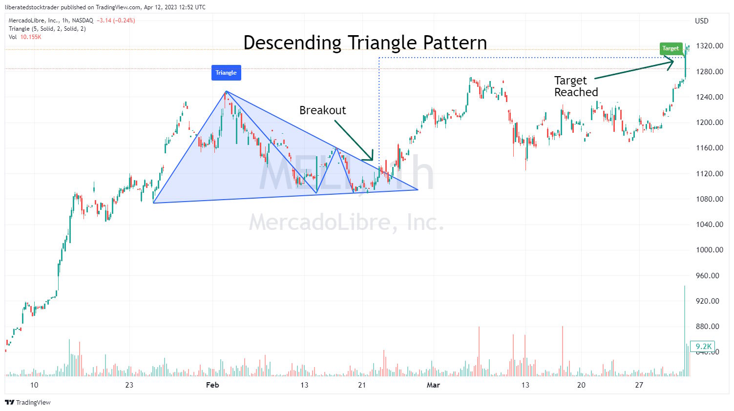
To identify a Descending Triangle chart pattern, investors should look for two downward-sloping trendlines that form a descending triangle. Generally, the pattern should be visible on intraday and daily charts. After identifying the two trendlines, investors can look for a confirmation of a trend reversal by watching for a breakout either above the upper resistance line or below the lower support line. If the security price breaks out above the resistance line, it could signal that the downtrend is now over, while a break below the support line could signal the continuation of the trend.
Stock Chart Pattern Accuracy
The following diagram shows us the most common reversal patterns and their relative probability of accuracy.
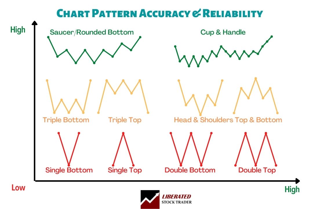
Price patterns and trendlines share the same characteristics. The longer they are, the more important they are. The more a price pattern touches a trendline and reverses, the more important that line is. This diagram shows that a Triple Top’s accuracy is more than that of a Single Top. Why? Because the price touches the resistance level more times.
Gaps in Stock Chart Patterns
Another significant pattern that signals continuation is the “gap.” A gap occurs when a stock’s price during a given period is significantly higher or lower than the price range of that stock for the previous period. The prices did not overlap at all over the two periods, leaving what is known as a “gap” in the price chart.
A “gap up” in the stock price is a show of strength. This tells us that the demand for the stock was so strong on the open that it jumped many points higher. The opposite is true for a “gap down.” This signifies weakness, as the stock gaps are usually due to aggressive selling.

The Breakaway Gap
The Breakaway Gap usually occurs when a stock moves through a price range or channel, then the demand for the stock explodes, and the stock “gaps out” of the current trend. This is a sign of strength and a very bullish sign with a “gap up.” A breakaway gap to the downside is a sure sign of weakness.
The Continuation Gap
The Continuation Gap is another sign of strength, showing that demand is still strong and the trend will continue; this often confirms the initial “breakaway gap.”
The Exhaustion Gap
The Exhaustion Gap can be the second or third gap during a powerful price upsurge. This is a warning, as it might signify that the stock has overextended itself, which may be due to a change in trend or a pullback. The opposite is true for an exhaustion gap on the downside, which might signal a bottom is near.
The Island Gap
The Island Gap occurs when demand is so high that price and the market participants drive the price up to unacceptable levels, and the demand dries up rapidly. This sudden oversupply causes the stock to plummet as all demand is satiated. Of course, too much supply with no demand causes falling prices.
Quick Tip: Gaps are important signs of serious shifts in supply and demand. If surges in demand outstrip supply, prices rise to convince people on the sidelines to sell. Conversely, downside gaps indicate supply is outstripping demand, causing prices to fall.
This might seem very theoretical, so here are gap patterns in action.
Examples of Stock Chart Gaps
Here, we can see clearly how gaps can occur in stocks. TEC provides a perfect example of how understanding gaps is critical to trading success.

Stock Chart Continuation Patterns
Continuation patterns occur during a price move and are visual representations of consolidation or rest periods before the price continues its trend, upwards or downwards.

Image courtesy of Liberated Stock Trader PRO Training. All rights reserved
All of these triangles are essentially continuation patterns. They should give you some confidence that the trend will continue. Always be aware that you should be prepared to act if the price breaks out in the wrong direction due to a shock (e.g., bad earnings or bad news).
A widespread continuation pattern is a rectangle, more commonly known as a “channel” or “trading range.” The price should normally break out in the same direction as the previous trend.
6. Add chart indicators
Stock chart indicators are popular among traders because they allow you to identify key levels and potential turning points in the market. Many indicators can be used, but most traders use a combination of two or more. It’s important to remember that indicators are not infallible; false signals can occur and should be filtered out.
It is also important to note that some chart indicators work better for certain markets than others. For example, momentum indicators are generally more useful in a trending market, while oscillators are best at identifying overbought and oversold levels in a sideways market.
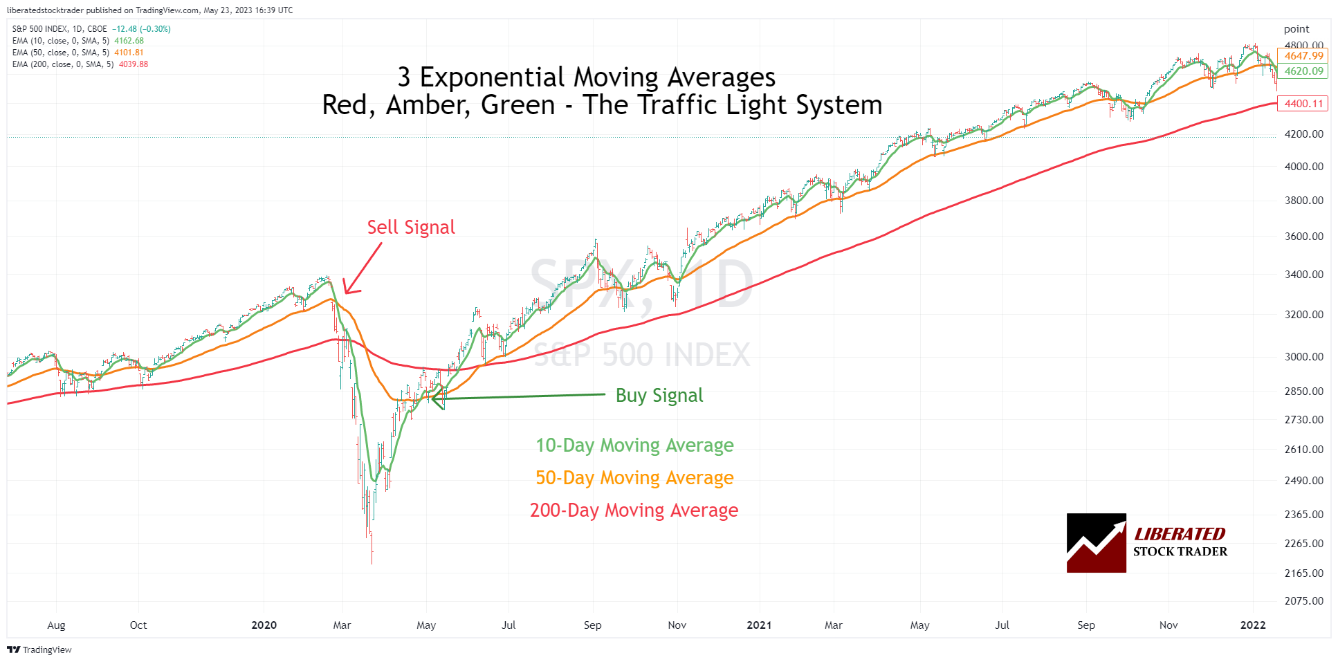
1. Simple moving average (SMA)
The simple moving average is the most common type of moving average; it averages out the closing prices of a security over a given period. The SMA smoothes out short-term price fluctuations, making it easier to spot longer-term trends.
Example Chart: Simple Moving Average

How do you calculate a simple moving average?
If we wanted to calculate a stock’s 5-day SMA, we would add up Apple’s closing prices over the previous five days and divide by five.
The formula for calculating a simple moving average is:
SMA = (Sum of Closing Prices / Number of Data Points)
Example Moving Average Calculation:
To calculate the 5-day SMA for Apple Inc., we can create a table with the following information:
| Day | Price | 5-Day Moving Average |
| Day 1 | 170 | |
| Day 2 | 172 | |
| Day 3 | 175 | |
| Day 4 | 174 | |
| Day 5 | 181 | 174.4 |
| Day 6 | 186 | 177.6 |
| Day 7 | 187 | 180.6 |
| Day 8 | 189 | 183.4 |
| Day 9 | 175 | 183.6 |
| Day 10 | 170 | 181.4 |
Using the SMA in trading requires identifying when prices move above the SMA line; this generally indicates that the trend is up. When prices move below the SMA line, this suggests a downtrend. Traders can also use crossovers as entry or exit points. A crossover occurs when the two SMAs cross and indicate a change in trend direction. For example, a buy signal is generated when the short-term SMA exceeds the longer-term SMA. Similarly, a sell signal is generated when the shorter-term SMA crosses below the longer-term SMA.
2. Exponential moving average (EMA)
The exponential moving average (EMA) is similar to the simple moving average, but it emphasizes recent data points more than older ones. The EMA gives more weight to recent prices than the SMA, making it a better indicator of short-term trends. This is because the EMA reacts more quickly to changing price trends than the SMA.
Example Chart: Exponential Moving Average
How do you calculate an exponential moving average?
The formula for calculating an exponential moving average is:
EMA = (Closing price – EMA(previous day)) x multiplier + EMA(previous day)
Example: To calculate the 5-day EMA, we would take the closing price on the latest trading day, subtract the 5-day EMA from the previous day, and add the result to the 5-day EMA of the previous day. We would then multiply this sum by a multiplier based on the number of periods in our moving average (in this case, five). The resulting figure represents our current 5-day EMA.
The multiplier is calculated using the following formula:
2 / (number of periods + 1)
For example, in the case of a 5-day exponential moving average, the multiplier would be 2/6 = 0.33. Each day’s price will contribute one-third (0.33) of the overall EMA value.
Using this example, if Apple’s closing price on the current trading day is $200, and its 5-day EMA from yesterday was $150, we would calculate our 5-day EMA for today as follows:
($200 – $150) x 0.33 + $150 = $170
Therefore, today’s 5-day EMA is $170. We can use this figure to compare with Apple’s current trading price and determine whether the stock is overbought or oversold. If the 5-day EMA exceeds the current trading price, the stock is oversold and may be a good time to buy. Alternatively, if the 5-day EMA is lower than the current trading price, the stock is overbought and may be a good time to sell.
Traders often use EMAs as entry and exit points. When prices move above the EMA, it indicates an uptrend; when prices move below the EMA, it suggests a downtrend. Crossovers are also used as signals for entry or exit points. A buy signal is generated when the shorter-term EMA crosses above the longer-term EMA, and a sell signal is generated when the shorter-term EMA crosses below the longer-term EMA.
What is EMA? Best Exponential Moving Average Settings Tested
3. Price Rate of Change Indicator
The Rate of Change chart indicator (ROC) is a powerful tool in technical analysis that gauges the speed and direction of price movements. As the name suggests, it assesses the rate at which a security’s price fluctuates over time by comparing current prices to recent ones. This comparison empowers traders to identify trending patterns in a security’s value, discern whether it’s on an upward or downward trajectory, and gauge the speed of price changes.
Video: Rate of Change Indicator Explained
Using the ROC indicator, traders can identify potential buying and selling opportunities and areas of potential risk. It can also confirm price pattern trends and breakouts.
The ROC line will move up or down depending on the rate at which the security’s price changes, with higher values indicating a faster rate of change and asset price growth. This can help traders identify when a trend is forming or gaining momentum and whether it may be time to enter or exit a trade.
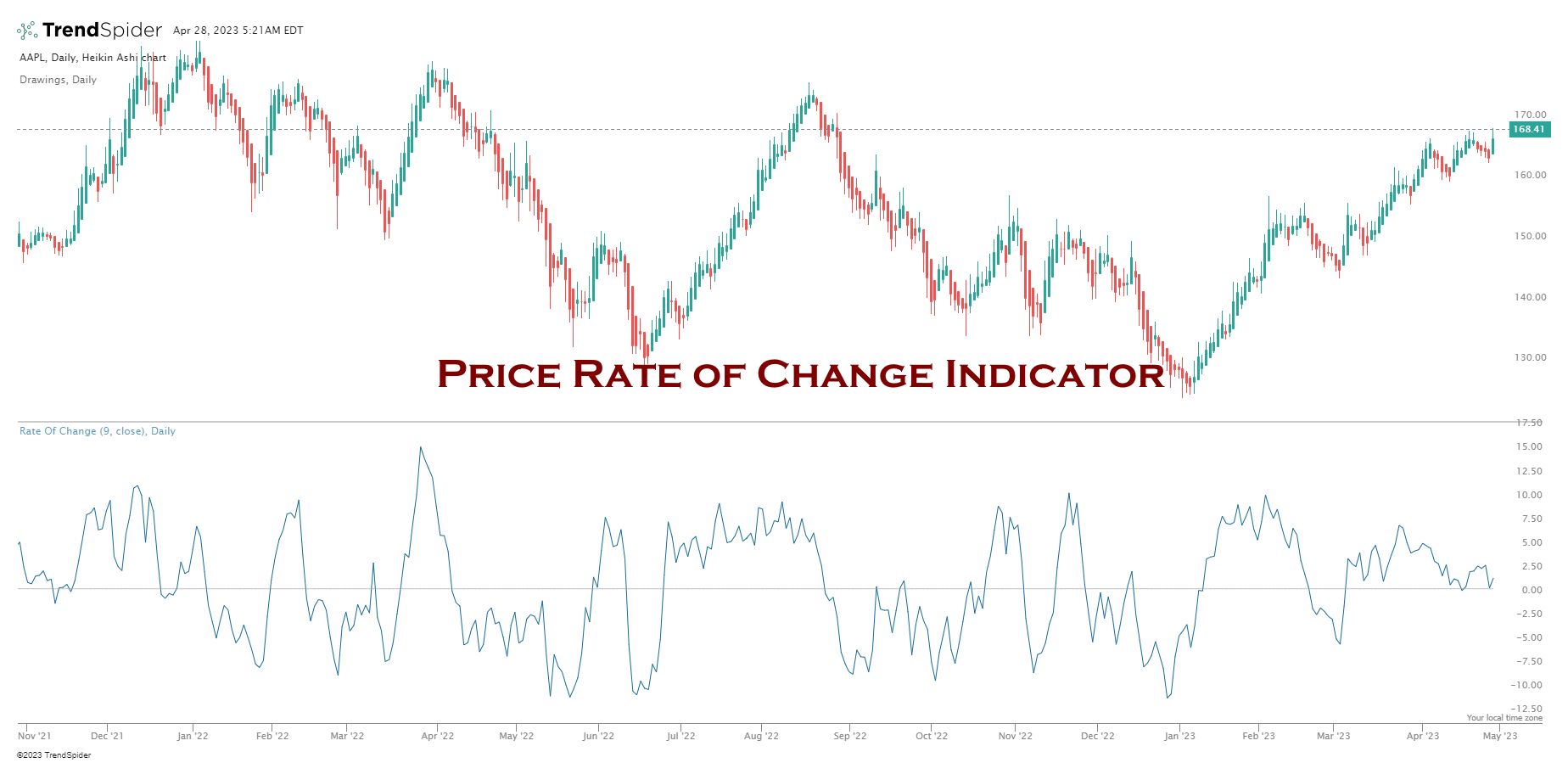
The price rate of change (ROC) is a technical analysis indicator used to gauge momentum. Momentum indicates the rate of change or acceleration of price movements for an asset. An increase in momentum suggests that the trend is becoming stronger and more likely to continue, while a decrease in momentum suggests that the trend may be weakening and could soon reverse. By monitoring this indicator, traders can gain insight into the speed of change.
11 Accurate Day Trading Indicators Tested & Proven with Data
7. Estimate the Future Direction of the Stock Price
Using Trendlines to Make Buy and Sell Decisions
So we have seen the Sideways Channel and the W bottom. But how do we know when a stock is going to take off?
The truth is we never really know.
All we can do is make judgments based on what we see. Do not forget we are only buying Stocks of companies that have
- Excellent Earnings per Share
- Strong acceleration in the growth of earnings per share
- Excellent Revenue growth
So we are, in essence, giving ourselves a great head start and reducing our overall risk.
4-Step Guide to Using Trendlines for Buy & Sell Decisions
- To evaluate an upward trend, draw a line joining the highest highs
- For the floor of the uptrend, draw a line connecting the lowest lows. The price here bouces three times off the bottom trendline but proceeds higher. The more bounces off a trendline, the stronger the trend.
- A trendline shows that the price has moved strongly past the previous high; this is a BUY Signal at $35.50.
- Finally, the price is exhausted and falls through the bottom resistance line at $53.
Based on the trendlines, buying and selling would have netted a 49% profit.

Life is never easy, and showing this retrospectively means we benefit from hindsight. This is why Wall St.’s finest minds have a host of other technical indicators accompanying price to enable you to assess trend quality.
Summary
You can learn how to read stock carts by learning seven process steps: open a chart, select a chart type, choose a timeframe, draw trendlines, add indicators, and estimate future price direction.
You know how to read stock charts and understand volume and stock chart indicators. But what is next? Take your skills to the next level with our 5 Star Amazon Rated Liberated Stock Trader Pro Stock Market Training Course
eBook PDF Download
You can download the “How to Read Stock Charts” PDF eBook here
FAQ
How to read stock charts?
The key to reading stock charts is visualizing the stock price pattern using trendlines and indicators. Draw a trendline by connecting the stock prices' highest highs and lowest lows. Then add the moving average indicator to the price to see the trend.
How to read stock chart patterns?
To read stock chart patterns, you need to interpret the stock price trend. There are three trends, up, down, and sideways. Plotting a trendline on the price enables you to see the trend; when the trend is up, buy; when the trend is down, sell.
How to predict stock charts?
To predict future stock chart prices, you must use the technical analysis of trendlines and chart indicators. Additionally, you should incorporate qualitative financial information, such as earnings, sales, debt, and growth.
How to find stock chart patterns?
To find stock chart patterns, you must first learn the types of patterns that exist and plot trendlines on charts to identify them. Alternatively, you can use software like TrendSpider to identify trendlines, Fibonacci, and Candlestick patterns automatically.
I’m trying to learn a new skill and stock trading came up on my mind.I contacted one of my friends and sent me your link.I just read some information and seems promising.
Very nice presentation and easy to understand for beginners.. thanks a lot ..
Thanks Gulshan
Is the plain vanilla OHLC or candlestick your preference?
Dr. Moore
it is definitely worth using candlesticks, in my soon to be released training and accompanying book, I show a really easy way to understand candlesticks which does not take forever to learn. Candlesticks are great because they allow you to visualize supply and demand in a simpler way. They are not 100% required, but are a nice supplement.
I like the information available on your blog. It makes it accessible to anyone that likes Trading but never had the time to get the key data in a concentrated manner.
Thanks for taking the time…
Joseph