Stock charts are the core of technical analysis, encompassing OHLC and Candlestick charts showing the open, high, low, and close prices.
Raindrop charts add volume data to chart analysis. Heikin Ashi charts smooth out price volatility. Finally, Kagi, Line Break, and Point & Figure charts eliminate the timeline from chart analysis, focusing solely on trends.
My research indicates that the most effective chart types for traders are Heikin-Ashi, Candlestick, OHLC, Raindrop, and Renko charts. These charts provide the optimal balance of price and trend reversal information to help investors develop effective trading strategies.
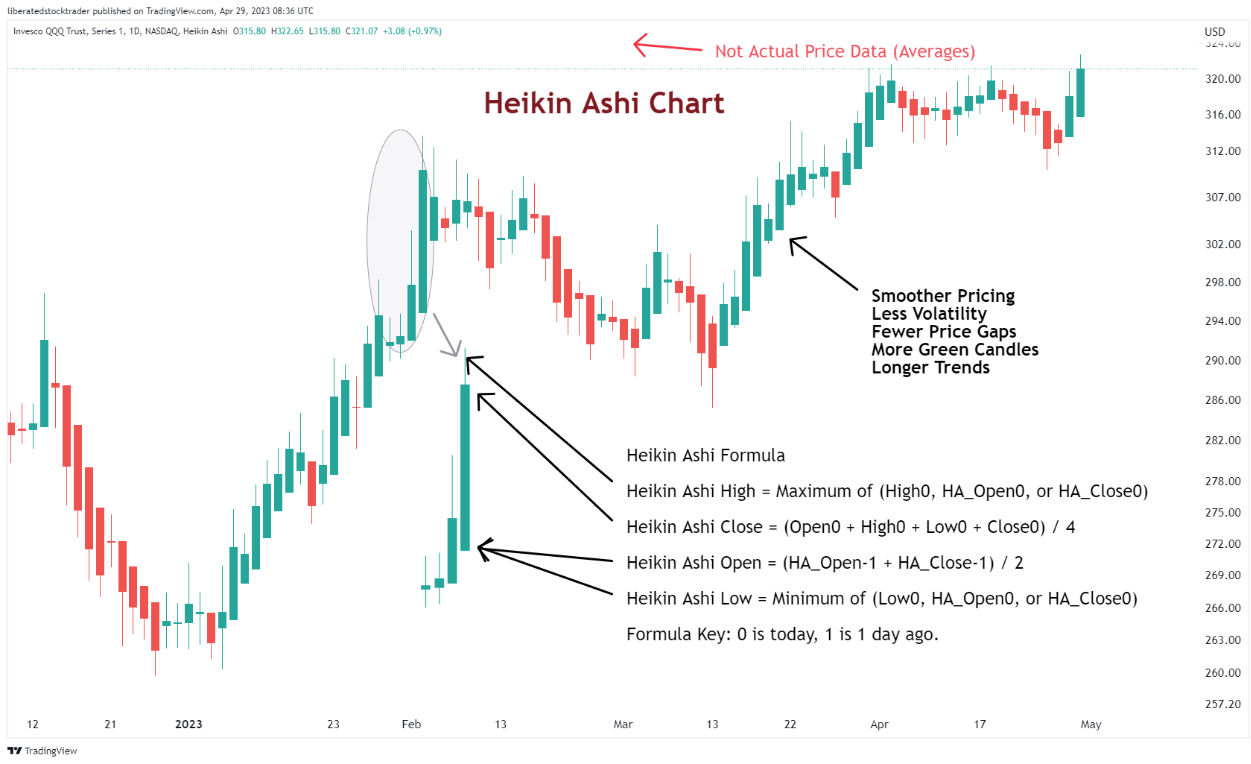
1. Heikin Ashi Charts
According to my testing, Heikin Ashi (HA) charts are the best-performing charts. They factor in recent price action to create more reliable and accurate data points than regular candlestick charts. It makes them ideal for traders who need to identify potential trading signals and long-term investors who want to confirm their investment strategies.
Heikin Ashi combines candlestick charting and price averaging to create an enhanced visual representation of trends. Essentially, Heikin Ashi smooths out daily volatility to unveil actionable price trends, making it a superior chart for developing trading strategies.
Get Heikin Ashi Charts on TradingView for Free
Heikin Ashi candles are a relatively recent approach to trading stocks and other financial assets. Although they have existed since the 1600s, their popularity has surged only recently due to their capacity to provide traders with more accurate trend data.
Heikin Ashi charts can identify support and resistance levels, recognize trading signals, and determine potential entry and exit points. Additionally, Heikin Ashi candles enable the measurement of momentum, volatility, and volume, providing a comprehensive overview of the market’s behavior.
My backtesting of Heikin Ashi charts reveals that they outperform buy-and-hold strategies with a 60% success rate, compared to 10% for standard OHLC bars and candlesticks.
How to Trade Heikin Ashi Charts
The most important factor when reading Heikin Ashi charts is identifying the trend. By examining the color of each candle, traders can determine whether the price is trending upward or downward. If a succession of candles has colors consistent with an uptrend (i.e., all green), it is likely that the price will continue to rise in the coming days. If, however, the colors are red, then it is likely that the price will continue to go down.
My Heikin Ashi Charts Explainer Video
Once a trend has been identified, traders can utilize Heikin Ashi candles to pinpoint support and resistance levels, as well as trading signals, which aid them in making more informed decisions when entering or exiting a trade.
TradingView 4.8/5⭐ : The Best Trading Platform I’ve Tested in 20+ Years
With lightning-fast charts, powerful pattern recognition, smart screening, backtesting, and a global community of 20+ million traders — it’s a powerful edge in today’s markets.

If you want one platform that gives you an edge, this is it.
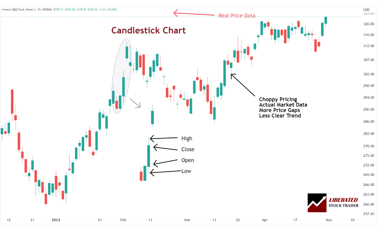
2. Japanese Candlestick Charts
Japanese Candlestick charts originated in the 1700s when rice traders in Japan began using them to predict and track price movements. They provide a graphic representation of price data over time. They comprise a body (the area between the open and closing price) and shadows (the area above or below the body).
The key benefit of using candlestick charts is that they enable traders to quickly identify potential market patterns, which can help them determine when to enter or exit a trade. For example, if a pattern appears where the upper shadow is consistently larger than the lower shadow, then this could indicate that buying pressure is increasing.
On the other hand, if there is consistently more selling pressure than buying pressure, it might be time for traders to exit their positions. By combining pattern recognition with support and resistance levels identified from candlesticks, traders can make informed decisions about when to buy or sell within their trading strategy.
Get Candlestick Charts on TradingView for Free
How to Trade Japanese Candlestick Patterns
Japanese Candlestick patterns are a powerful tool many traders use to identify trends and potential reversal points in the market. The ability to recognize these candlestick patterns can help traders identify important support and resistance levels or attempt to predict the direction the price may take next. By combining technical analysis with fundamental analysis and news events, traders can get an edge over the markets.
However, it is important to remember that no system or method is perfect. You should always use sound risk management when trading and properly backtest any trading strategy. With proper practice, traders can use candlestick patterns to their advantage and generate consistent profits.
How many candlestick patterns are there?
There are over 200 candlestick patterns; some of the more commonly used ones include the Engulfing, Bearish Harami, Bullish Harami, Doji, and the highly profitable Inverted Hammer and Marubozu.
Each pattern has its unique characteristics that can be used to identify potential trading opportunities. It is important to note that the interpretation of each pattern may vary depending on the timeframe being used. Additionally, some patterns may be more reliable than others. As a trader, it is essential to comprehend the intricacies of each pattern and how they can be effectively applied in various market scenarios.
Using TrendSpider Candlestick Pattern Recognition
The problem with candlestick patterns is that there are numerous patterns to remember, making it time-consuming to identify them accurately. That is where software like TradingView and TrendSpider can help.
TrendSpider is the only trading software that enables scanning and point-and-click backtesting of 230 candlestick patterns. It is a great place to start if you want to gain an edge in trading.
Get TrendSpider’s Pattern Recognition & Charts
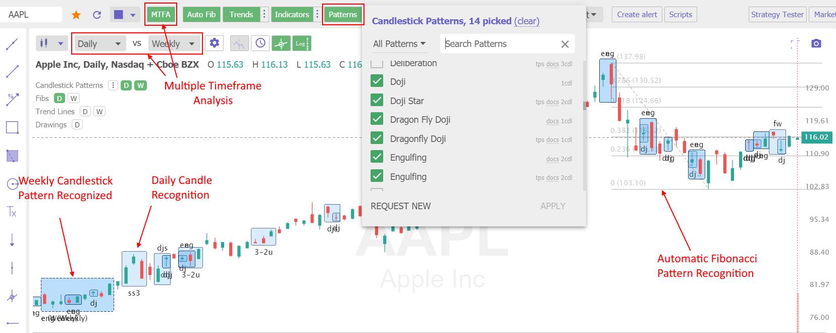
Using TradingView Candlestick Pattern Recognition
TradingView includes intelligent candlestick pattern recognition for free, but you must learn Pine Script coding to perform any backtesting.
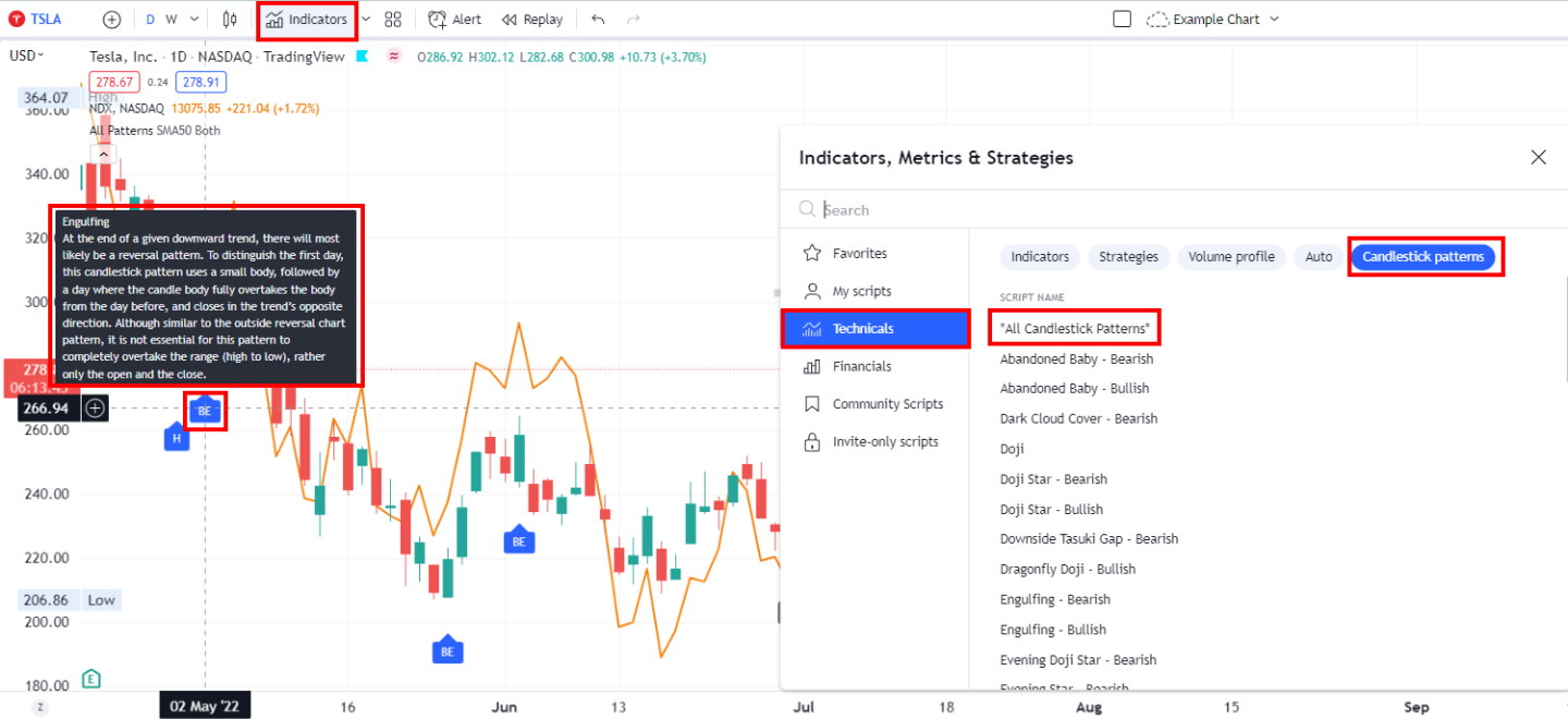
TradingView has powerful and intuitive candlestick chart pattern recognition.
Get TradingView’s Pattern Recognition for Free
Remember that candlestick patterns are only one tool among many in technical analysis. Combining other indicators and methods is important for a comprehensive approach to trading.
| Candlestick Software | TrendSpider | TradingView | MetaStock |
| Rating | ★★★★★ | ★★★★⯪ | ★★★★⯪ |
| Candlestick Patterns Recognized | 123 | 27 | 52 |
| Pricing | Included | Included | $349 add-on |
| Full Review | Read the Review | Read the Review | Read the Review |
3. OHLC Charts
For the more traditional traders, OHLC charts can also be used to analyze patterns and price trends. These bar charts show a given security’s opening, high, low, and closing prices over a specified period. While they don’t have the same level of detail as candlestick charts, they still provide useful information for traders looking for entry and exit points.
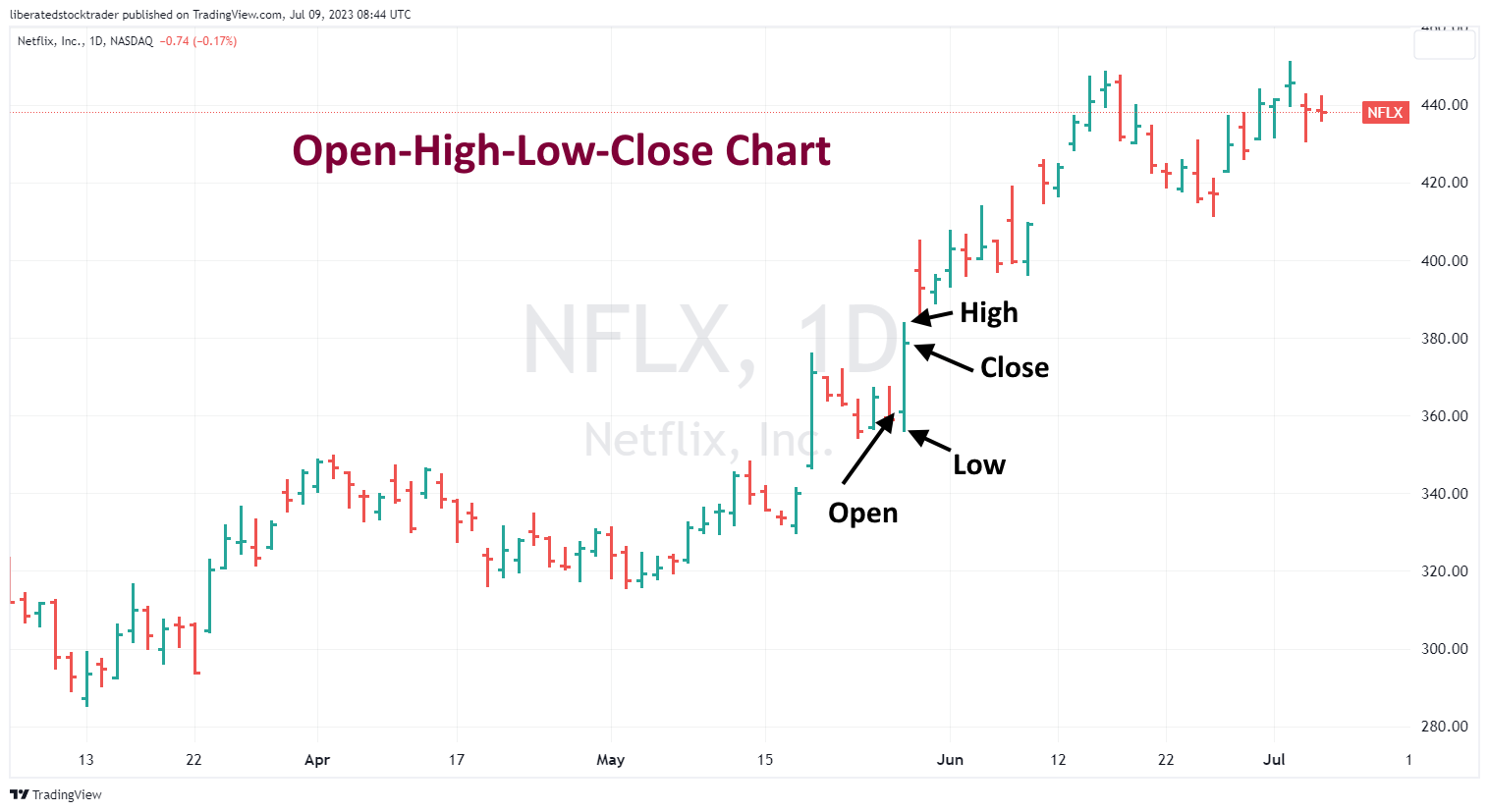
Get OHLC Charts on TradingView for Free
How to Trade OHLC Charts?
When trading with OHLC charts, traders should look for patterns that indicate a trend. Common patterns to look for include breakouts, flags, pennants, double bottoms, and cup-and-handle patterns. By analyzing these patterns, traders can identify market entry and exit points. Traders should also pay close attention to support and resistance levels, as they can provide useful information on the strength of a trend. Additionally, traders should be aware of any news or economic events that could affect the traded security.
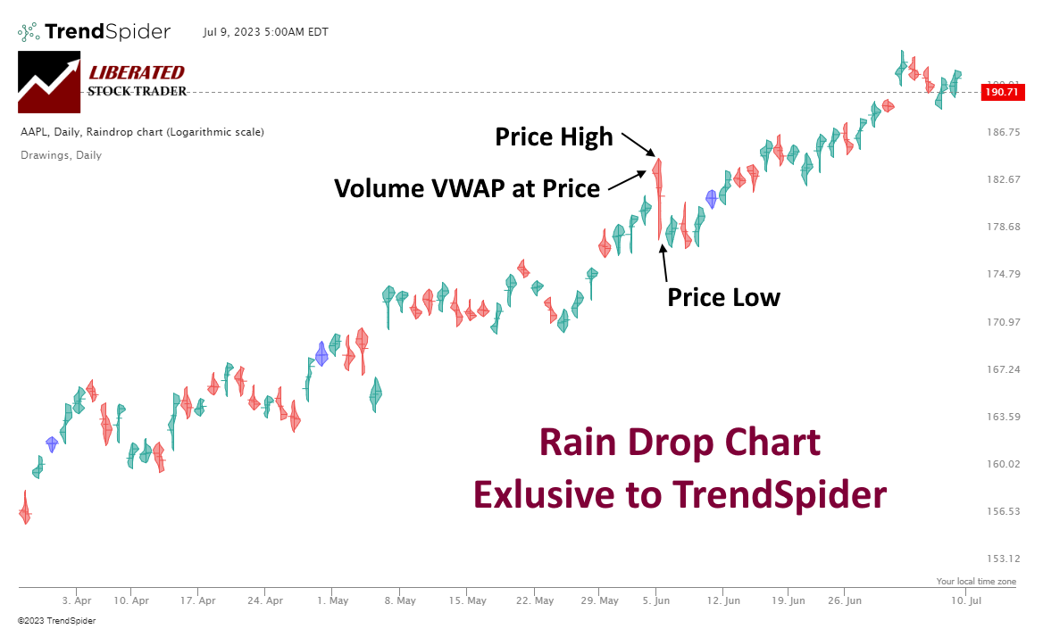
4. Raindrop Charts
Raindrop charts are a unique charting style developed by TrendSpider that helps traders visualize a security’s price and volume action. This chart type consists of a series of candles, each representing a single trading session.
Raindrops, unlike traditional candlesticks, do not possess open or close prices. Instead, they are formed by combining a high, a low, a left VWAP, and a right VWAP. The left side represents the first half of the trading period, while the right side represents the second half. The width of each segment corresponds to the trading volume at different price levels. The dashes indicate the VWAP for each respective period. This unique representation offers a comprehensive view of trading dynamics, providing traders with valuable insights.
Get TrendSpider’s Raindrop Charts
How to Trade Raindrop Charts
Raindrop charts use VWAP and Volume Profile to provide valuable insights into the correlation between price and volume movements. These charts visually represent whether buyers or sellers dominate the market, empowering traders to make well-informed decisions based on support and resistance levels.
Moreover, Raindrop charts are useful in identifying moments of market indecision. The appearance of Blue Doji Raindrops (as shown in the above chart) often signifies a battle between buyers and sellers, indicating a potential trend reversal. Additionally, this analysis technique helps pinpoint crucial support and resistance levels.
By leveraging the advantages of Raindrop charts, traders can enhance their understanding of market dynamics and refine their trading strategies. Find out more about Raindrop charts at TrendSpider’s help page.
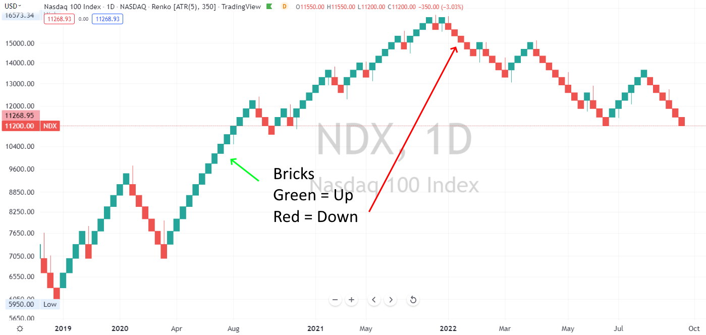
5. Renko Charts
Renko charts (also known as Brick Charts) are another popular analysis tool used to identify support and resistance levels in the market. Unlike traditional candlestick charts, Renko bricks have equal sizes, regardless of the trading range. They are especially useful for identifying trends within markets that tend to experience high levels of volatility.
The chart consists of a series of price-based boxes, with no time component, meaning that each box represents a specific price move. A new brick appears on the chart when an asset reaches a specific price level or surpasses it. By analyzing Renko charts across various timeframes, traders can identify potential buy and sell signals, as well as entry and exit points for their trades.
Get Renko Charts on TradingView for Free
How to Trade Renko Charts
Renko charts provide an effective means of detecting potential buy and sell signals. The process typically involves identifying clusters of bricks that form at support and resistance levels. To capitalize on a buy signal, it is prudent to wait for the price to exceed the resistance level before executing the trade. Conversely, when a sell signal emerges, it is advisable to wait for the price to dip below the support level before entering the trade.
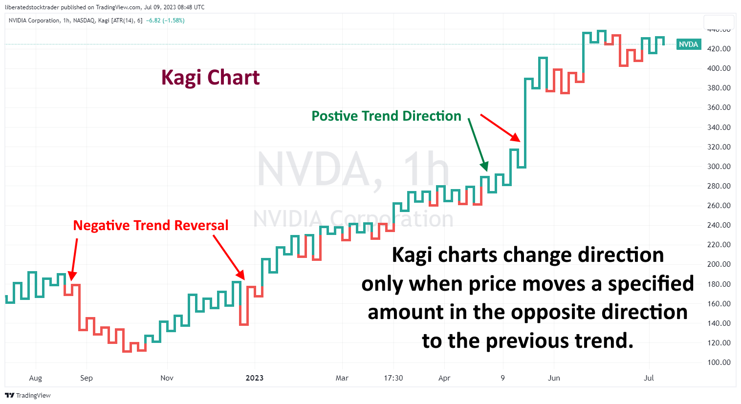
6. Kagi Charts
Kagi charts identify support and resistance levels to find buy and sell signals. Opposite to Renko Charts, Kagi Charts use price action instead of price movement. The x-axis of a Kagi Chart doesn’t represent time but rather the change in the price of an asset: when the price increases, the line plotting it rises; when the price decreases, the line plotting it falls.
Suppose the high or low of two consecutive trading sessions is not exceeded by a specified amount (the reversal amount). In that case, that session is not charted, maintaining a record of only significant movements. This enables traders to identify potential support and resistance levels more quickly than other techniques. By watching for these lines to cross over each other, it’s possible to detect buy and sell signals, as well as entry and exit points for their trades.
Get Kagi Charts on TradingView for Free
How to Trade Kagi Charts
Kagi Charts completely disregard time intervals and effectively filter out the associated noise. When considering price movement as the sole important variable, the generation of new lines becomes significant. Noteworthy line changes usually require substantial price movements. Therefore, minor natural price variations occurring over time can be disregarded. Kagi Charts find various practical applications, including basic line reversal trading signals, support and resistance identification, and analysis of sequence-based reversal patterns.
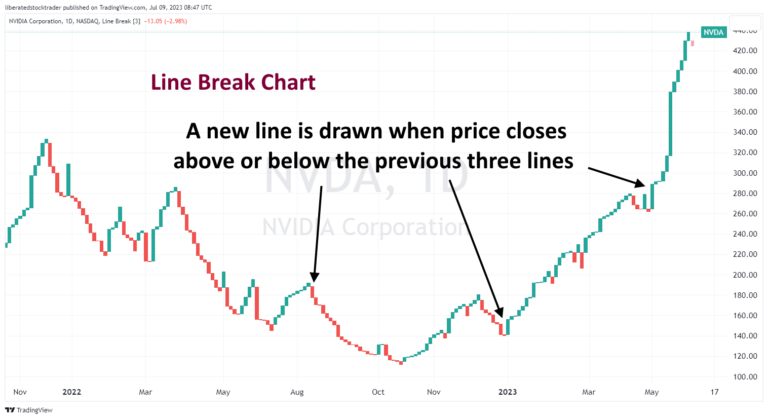
7. Line Break Chart
Line break charts are similar to Kagi Charts, focusing on price movement as the only important variable. The difference is that line break charts generate new lines each time the closing price exceeds the high or low of a previous period, typically set at 3 bars. This chart type also disregards time intervals, allowing traders to identify potential entry and exit points based on the reversal of trend signals. Line break charts can also be used for identifying and analyzing support and resistance levels, as well as sequence-based reversal patterns.
Get Line Break Charts on TradingView for Free
How to Trade Line Break Charts
Line Break Charts help traders identify support and resistance levels by providing easy-to-see horizontal lines that signify the reversal of a previous trend. Traders can use these to spot entry points when prices break out from one level to another and potential exit points when prices return toward their original trend.
By analyzing the sequence of horizontal lines on a Line Break Chart, traders can look for patterns that indicate a potential reversal in the trend. These often occur when prices move from one level to another and back to their original level before continuing in the opposite direction.
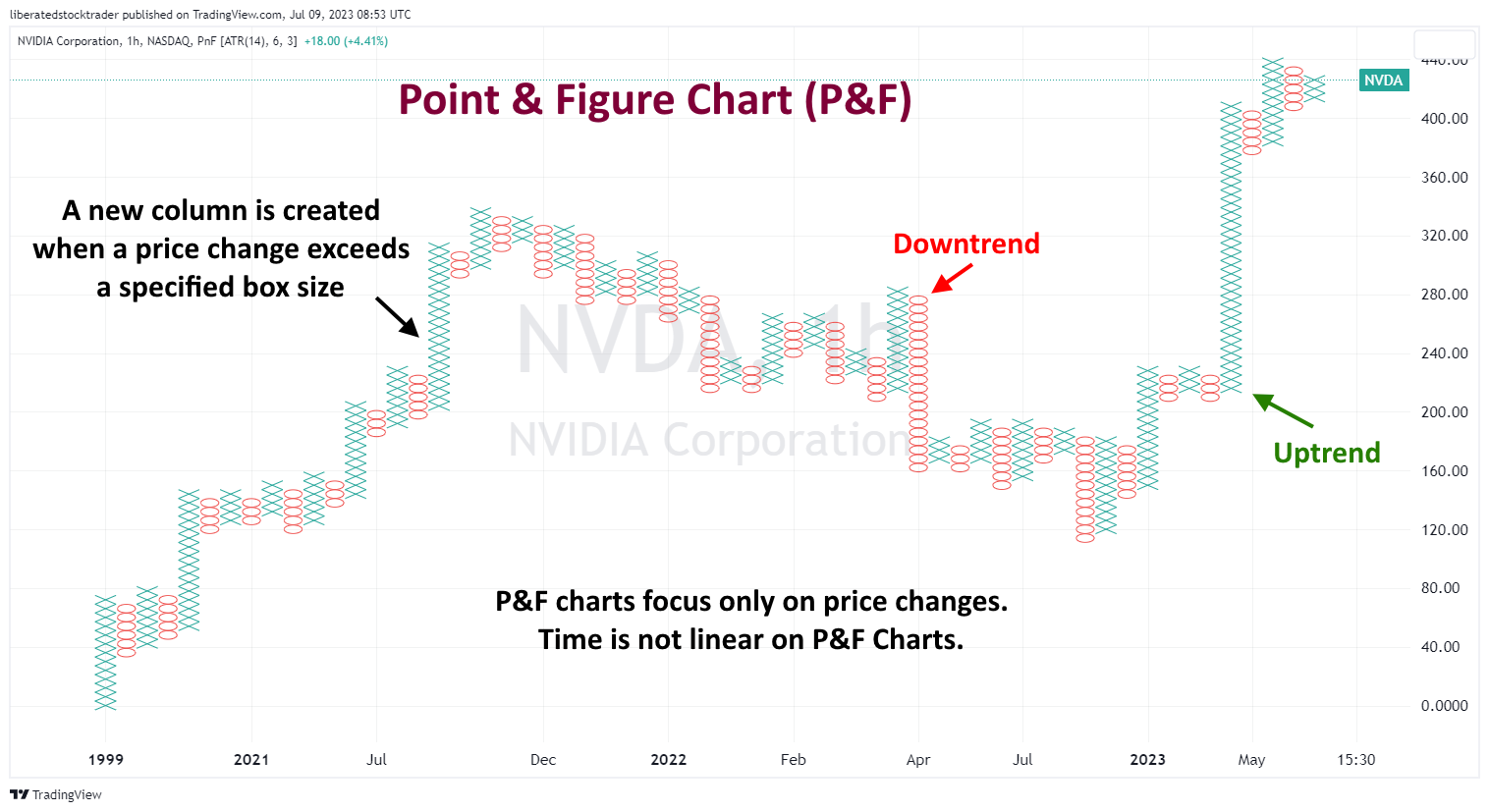
8. Point & Figure Charts
Point-and-figure charts (P&F) are composed of ‘Xs’ and ‘Os,’ representing price movements. When prices increase, an ‘X’ is plotted on the chart, and an ‘O is plotted when they move down. These charts help traders identify support and resistance levels by plotting points that signify a reversal in the trend. P&F charts ignore time and volume, making them ideal for identifying long-term trends.
Each point on a P&F chart represents a set price movement (the box size). This eliminates noise and helps traders identify similar trends. For example, a box size of $5 would mean that each ‘X’ or ‘O represents the stock moving up or down by at least $5.
Get P&F Charts on TradingView for Free
How to Trade P&F Charts
By studying Point and Figure Charts, traders can identify resistance and support levels by looking for patterns of ‘Xs and ‘Os that indicate a potential reversal in price movement. They can also look for breakouts when prices move out of the pattern and continue in the opposite direction. This is often viewed as an indication that the trend is shifting and may serve as a signal for entering or exiting a position.
Point and Figure Charts can also help identify consolidation areas when prices move within a range without making any significant progress, either up or down. This type of charting allows traders to identify potential opportunities to enter or exit positions based on their analysis.
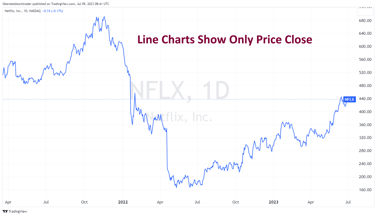
9. Line Chart
Line Charts are one of the most commonly used forms of stock charting, created by connecting data points (closing prices) with a line. This type of chart is easy to read and provides traders with an indication of the overall trend over time. Line charts are often used to identify support and resistance levels, as well as areas of consolidation. They can also identify price patterns that may signal potential reversals in price movement. Additionally, they provide an easy way to compare current prices with previous periods, allowing traders to make more informed decisions about how best to enter or exit a position.
Get Line Charts on TradingView for Free
How to Trade Line Charts
Although line charts provide less information than other chart types, they are good for comparing different asset prices on the same chart. For example, a line chart can be used to compare the stock prices of multiple companies in the same sector over time.
In addition to viewing simplistic line charts on TradingView, traders can add indicators and overlays to get detailed insights into their trading positions. For example, a trader can add a 200-day moving average to their line chart and then look for price divergence between the current stock vs. its expected trading range. Additionally, traders can use TradingView’s ‘Compare’ tool to compare different assets on the same chart. This provides an easy way to visualize how different assets perform relative to one another.
FAQ
How do I create a stock chart?
You can easily create stock charts using TradingView. Log in to the platform, select a symbol from the toolbar, and adjust the chart settings to your preferences. TradingView will automatically save any changes you make to your chart.
What are the different types of stock charts?
There are 9 different types of stock charts you should consider using when trading. Our favorites include Heikin Ashi, Japanese Candlesticks, OHLC, Renko, Kagi, and Line Break charts. Each of these charts has a unique design and benefits.
What are the most popular stock chart types?
The most popular types of stock charts are line charts, bar charts, and candlestick charts. Line charts show how a security's price changes over time. Bar charts provide more information by showing each period's open, high, low, and closing prices. Candlestick charts use color-coded and hollow/filled bars to show market sentiment and help traders identify potential opportunities for trading.
Which software offers the most different chart types?
TradingView has 17 different chart types, the largest selection of charts available today. MetaStock has ten chart types and over 300 indicators. Finally, TrendSpider has seven chart formats and the best AI-powered pattern recognition and backtesting.
How can I compare different stocks on one chart?
TradingView's 'Compare' tool lets you compare multiple stocks on the same chart. This feature is particularly useful if you are looking for divergences or correlations between multiple assets.
How do I add indicators and overlays to my chart?
To add indicators and overlays to your existing chart, click on Studies or Indicators at the top of your screen and select an indicator from the dropdown list. You can further customize each indicator with parameters like average true range or time periods.
How do I read candlestick patterns?
Candlesticks consist of four parts – open price, high price, low price, and closing price – represented as colored bars in a chart. Depending on whether prices moved up or down during that period, traders can gain deeper insight into market sentiment by reading candlestick patterns such as "hammer" or "Doji."
What is the best stock chart for traders?
According to our testing, the most profitable and accurate chart type is Heikin Ashi. The smoothing effect of its bar improves the performance of the chart indicators it is paired with. Candlestick Charts are another great option for trading patterns. Both TradingView and TrendSpider offer Heikin Ashi and Candlestick charts.
What is the best stock chart for long-term investors?
For long-term investors, Stock Rover offers the finest stock charts available. These charts display fundamental data like earnings, cash flow, and financial ratios. For long-term investors, Stock Rover is the top choice for insightful stock charts.
What is volume analysis in charts?
Volume analysis is a technical analysis method used to measure buying & selling pressure in securities markets by monitoring changes in traded volumes over certain periods. By combining volume data with other technical indicators, such as momentum or oscillators, traders can more accurately identify potential buy & sell signals.
Market profile stock charts certainly must be a goto for day traders. Gotta spot activity during each time frame.
I have to say that for the past few of hours i have been hooked by the amazing trading articles on this blog. Keep up the good work.