Understanding the distinction between linear and logarithmic charts is essential for financial market technical analysis or data visualization.
Linear chart scales plot data at regular intervals, making it simple to see changes in data that have small fluctuations. Logarithmic chart scales represent percentage moves.
They are especially useful when analyzing data that covers a large range of values, as they can show proportional relationships and percentage changes more effectively.
Key Takeaways
- Linear charts plot data uniformly, suitable for consistent increments.
- Logarithmic charts are ideal for heterogeneous data, indicating relative changes.
- Selecting the correct scale is imperative for accurate data analysis and visualization.
Choosing the appropriate chart scale can greatly impact how data trends and movements are perceived. A linear chart is often used for its straightforward depiction of information where increments are consistent.
However, a logarithmic chart is preferred when the data demonstrates exponential growth or covers several orders of magnitude, as it helps to compare relative changes over time. Understanding when to use each scale type is crucial for accurately interpreting data and making informed decisions based on the displayed information.
Understanding Chart Types
In charting, the scale used on the y-axis can greatly affect the interpretation of the data. Different scales can provide diverse perspectives and insights, particularly when comparing a linear scale to a logarithmic scale.
Defining Linear Charts
A linear chart features a linear scale where equal increments on the axis represent equal changes in the data values. This means that each unit increase on the y-axis corresponds to the same absolute increase in the data, making it straightforward to interpret. Linear scales are commonly used for evenly distributed data, where the focus is on the absolute difference between data points.

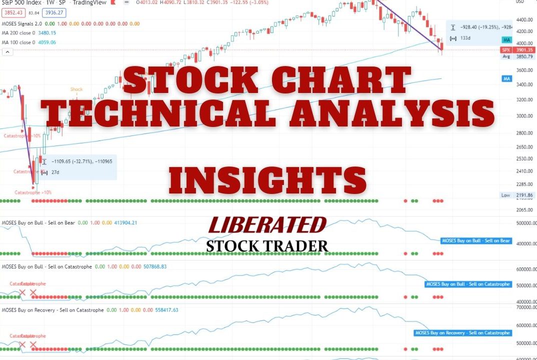
View an S&P 500 Chart on TradingView
Defining Logarithmic Charts
Conversely, a logarithmic chart uses a logarithmic scale where each increment on the y-axis represents an exponential increase in the data value. This type of scale is particularly useful for data that spans several orders of magnitude, as it can make it easier to see percentage changes and multiplicative factors. Logarithmic scales are often preferred in financial charts, where relative changes and growth rates are more important than absolute values.
View an S&P 500 Chart on TradingView
Comparing Chart Scales
The difference between linear and logarithmic charts lies in how they represent data on the y-axis. In a linear scale, points are equidistant, with the same vertical distance between two consecutive points of equal incremental value. However, the spacing between ticks increases as the values rise on a logarithmic scale since the scale represents the same percentage change between any two equidistant points.
This scaling allows logarithmic charts to compactly display data that would otherwise be too spread out or condensed on a linear scale. Logarithmic scaling can be more insightful when analyzing data with exponential trends or wide-ranging values, providing a clearer long-term perspective.
View an S&P 500 Chart on TradingView
Analyzing Price Movements and Trends
When traders assess price movements and trends of securities, the scale choice—linear or logarithmic—can significantly influence the interpretation. Differences in scale impact the visibility of trends, absolute and relative changes, and the perceived strength of trend lines.
Linear Charts for Short-Term Analysis
Linear charts, often referred to as arithmetic charts, plot price movements with equal vertical distances for equal absolute changes in price. They are especially useful for day traders and those focused on short-term analysis, as these charts illustrate small, incremental price changes. In this context, small movements are as visually significant as large ones, provided they represent the same absolute change in value.
Logarithmic Charts for Long-Term Analysis
Conversely, logarithmic charts are invaluable for traders with a long-term perspective. They represent price movements in terms of percentage, meaning that equal vertical distances reflect equal relative changes, not absolute price changes.
This scale is crucial when analyzing securities over a longer period where multiplicative changes, like those seen in a stock’s exponential growth, are better visualized. Trends are easier to decipher on a logarithmic scale as they diminish the drastic appearance of large price drops or spikes over time.
Choosing the Appropriate Chart for Trading Style
The decision between linear and logarithmic charts aligns with a trader’s trading style and the period they are analyzing. For those employing quantified strategies requiring precise price points, linear may be more appropriate.
Logarithmic charts are often preferable for traders looking at trends where relative change is more significant, especially over extended time frames.
Chart Scale Impact on Technical Analysis
In technical analysis, the scale chosen for charting can significantly impact how trend lines, patterns, and volatility are interpreted. The choice between using a linear or logarithmic scale is especially pivotal when analyzing large price movements and percentage changes in the market.
Impact of Scale on Trend Lines and Patterns
On linear scales, where a price unit is represented equally along the vertical axis, trend lines and patterns show absolute price changes. This simplicity can make trend lines straightforward for short-term analysis, where price action is less varied. However, this can misrepresent the significance of price moves, particularly in long-term charts where a high-value stock may have large absolute movements that are visually exaggerated compared to a low-value stock’s movements.
By contrast, logarithmic scales, which display price movements in percentage changes, tend to provide a more accurate representation of market movements, especially over extended periods. With logarithmic scaling, similar angular inclinations in trend lines imply consistent rates of return. This can be particularly useful when analyzing patterns in volatile markets or sectors, as it accounts for proportionate growth and diminishes the visual impact of large price movements.
Understanding Volatility and Market Dynamics
The chart scale also plays a role in interpreting volatility. Linear scales might magnify volatility in higher-priced assets because they don’t adjust for the relative price change. This can lead to a misinterpretation of market dynamics and over- or underestimation of risk. Logarithmic scales, representing equal percentage changes with equal distances on the scale, offer clarity and a better sense of proportion regarding price action and volatility.
For instance, if a stock moves from $10 to $20, it is a 100% increase, whereas a move from $100 to $110 is only a 10% increase; a logarithmic scale adequately reflects this difference. Consequently, technical analysts often favor logarithmic charts when dealing with assets that have experienced significant growth over time, as they can better analyze and compare different time frames or assets regardless of the absolute price level.
Stock and Equity Curves
When the data spans several orders of magnitude, stock and equity curves benefit greatly from logarithmic scales. These scales make it easier to perceive percentage increases within the market over time, as they consider relative changes rather than absolute ones. For instance, a comparison of linear and logarithmic charts shows that logarithmic scales are more effective when deciphering long-term growth trends in an asset’s performance.
Setting Buy or Sell Targets
Choosing an appropriate scale is key when setting buy or sell targets on a stock chart. Linear scales may be more suitable for short-term trading as they display price differences uniformly. A fixed distance on the chart reflects the same price increment regardless of the asset’s value. On the other hand, logarithmic scales, by emphasizing percentage changes, aid investors in setting buy or sell targets in markets experiencing exponential growth or decay.
TradingView 4.8/5⭐ : The Best Trading Platform I’ve Tested in 20+ Years
With lightning-fast charts, powerful pattern recognition, smart screening, backtesting, and a global community of 20+ million traders — it’s a powerful edge in today’s markets.

If you want one platform that gives you an edge, this is it.
Data Ranges and Scale Selection
The choice of linear or logarithmic scales is pivotal in data visualization. It ensures that the data set is represented proportionally and accurately, especially when dealing with varying data ranges.
Dealing with a Wide Range of Values
A logarithmic scale is often the best choice for data sets that span a wide range of values, such as several orders of magnitude. This type of scale represents values not by equal increments but in a way where each unit increase on the axis corresponds to a tenfold increase in the represented data. This allows for a compressed view, which makes it possible to visualize large-scale variations in a data set efficiently and proportionally. Logarithmic scales are particularly useful in financial charts or when visualizing exponential growth or decay phenomena.
Representing Data Sets Accurately
Conversely, when data consists of values within a relatively small range, a linear scale is typically the optimal choice for accurate representation. Linear scales illustrate increments in fixed, equal intervals, which helps in comparing values directly and identifying changes or trends within the data range. This type of scale is intuitive as it aligns with how people usually perceive numbers. A linear scale ensures that differences between values are visually consistent across the chart, supporting clear and precise interpretation without distortion of the data set’s proportions.
Benefits and Limitations of Chart Scales
Choosing the right chart scale is crucial for data visualization, as each scale has distinct benefits and limitations. Understanding these can significantly enhance the interpretation of charted data.
Advantages of Logarithmic Scaling
Logarithmic scaling is particularly useful when dealing with data that spans several orders of magnitude. It converts large range values into a format that is more visually digestible. This scale is beneficial when:
- Analyzing percentage moves: A log scale reflects relative or percent changes more clearly, making comparing proportional differences between values easier.
- Tracking exponential growth: Logarithmic scaling offers a clearer representation of the growth pattern for datasets with exponential changes, such as rapidly growing companies or biological populations.
- Visualizing congested areas: Charts with many data points that are close together or congested are often clearer with a log scale, preventing the details from being lost.
Suitability of Linear Scaling
Linear scaling is straightforward and effective when the focus is on absolute differences. Its characteristics include:
- Unit value clarity: Linear scales show changes in actual dollar value or unit value, which can be better for assessing precise differences.
- Uniform Data Representation: Since every unit change is the same distance on the scale, data on linear scaling is easier to interpret at a glance for consistent incremental data.
- Ideal for short-term analysis: A linear chart is more suitable for day trading or other short-term financial analyses, as it accurately represents the fluctuations within a smaller timeframe.
FAQ
What is the difference between linear and logarithmic charts?
Linear charts display data evenly along the axis, where each unit of measurement is separated by the same distance. In contrast, logarithmic charts represent data according to magnitude, where each unit of distance on the axis represents the size of the move.
What are the differences between linear, logarithmic, and exponential scales?
Linear scales advance by equal increments, logarithmic scales increment by powers of a given base number and exponential scales showcase data that doubles at a constant rate.
When should a linear scale be used over a logarithmic scale?
A linear scale should be employed when data points are uniformly spread out or when assessing changes over shorter ranges or smaller datasets. This scale is most effective when there isn't a wide variance between the highest and lowest data points.
When should a log scale be used instead of a linear scale in trading?
Using a log scale in financial trading is more suitable when analyzing data over a longer time frame or with a broad range of values. It helps to identify the percentage changes and relative performance effectively, as seen with volatile price movements.
How does linear growth contrast with logarithmic growth?
Linear growth indicates an addition of a constant quantity over equal periods, leading to a straight-line increase. Logarithmic growth, on the other hand, depicts a rapid increase initially that decelerates over time, resulting in a curve that slowly flattens as the values increase.