Tick charts are constructed by plotting price movements after a specified number of transactions. Unlike traditional time-based OHLC or candlestick charts that represent price action over a set period, tick charts update after a predefined trading volume threshold is reached.
This design allows traders to observe liquidity with greater resolution, making tick charts particularly popular among day traders.
Tick charts offer a dynamic view of market activity, mapping the ebb and flow of trades with every tick. A new bar is created by setting a predefined number of transactions—100, 1000, or any other preferred tick size—providing a clearer picture of the trading velocity and potentially highlighting shifts in market trends more rapidly than the traditional time-based charts.
Key Takeaways
- Tick charts provide a high-resolution view of market movement by charting prices after a set number of trades.
- They are particularly useful for day traders seeking to pinpoint trend changes and momentum more swiftly.
- Each asset traded has a unique volume profile, which means Tick charts require extensive user customization. This makes them cumbersome to use.
Understanding Tick Charts
Tick charts are a tool for traders seeking a granular transaction-based view of market activity. Tick charts update only when a trade volume threshold is exceeded.
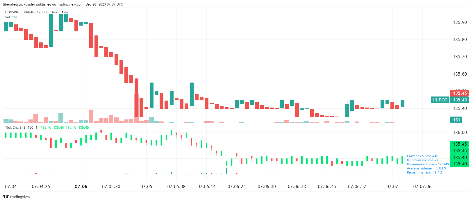
The chart above shows a Heikin Ashi candlestick time-based chart (upper window) compared to a Tick chart (lower window). You can see the trend is different in both charts.
Defining Tick Charts and Their Purpose
Tick charts measure trading activity transactions – “ticks” – rather than time. Each tick represents a trade, and a new tick is plotted after a certain number of completed transactions. Tick chart trading shows the intensity of trading activity that can be obscured on time-based charts.
Tick Charts vs. Time-Based Charts
While time charts create a new bar after a predetermined time interval, tick charts do so after a specific number of trades have occurred. This difference can be significant in markets where the volume of trades can vary dramatically within a short period. Tick charts are often favored by traders who wish to see a clearer representation of market activity during periods of volatility as they adjust to the pace of trading without time constraints.
Tick Chart vs. Bar Chart vs. Candlestick Chart
- Tick charts distill market information down to the activity of individuals or groups of transactions, showing the market’s raw trading pulse.
- Bar charts reflect the price action of a security over a set period, providing open, high, low, and close values for each interval.
- Candlestick charts offer visual cues through the body and wicks of the candle regarding the direction of price movement and the extent of price volatility over time.
Tick charts can be particularly useful for identifying trend exhaustion periods and smoothing pre-market and after-hours trading volume, as they give equal weight to each trade. Meanwhile, bar and candlestick charts can make it easier to spot patterns over fixed time intervals, but may not reveal the intensity of trading during those periods.
TradingView 4.8/5⭐ : The Best Trading Platform I’ve Tested in 20+ Years
With lightning-fast charts, powerful pattern recognition, smart screening, backtesting, and a global community of 20+ million traders — it’s a powerful edge in today’s markets.

If you want one platform that gives you an edge, this is it.
The Mechanics of Tick Charts
Tick charts are a specialized trading tool that reflects transactional data more dynamically than traditional time-based charts, offering traders insights into market volatility and liquidity.
How Tick Charts Work
Tick charts are constructed by plotting price movement on the y-axis against transactions on the x-axis, where each tick represents a trade. Unlike time-based charts that advance with each passing minute or hour, tick charts move only after a specific number of trades have been executed, regardless of the time it takes for these trades to occur. A new bar is formed on the chart when the specified number of transactions occurs.
Here’s a brief breakdown:
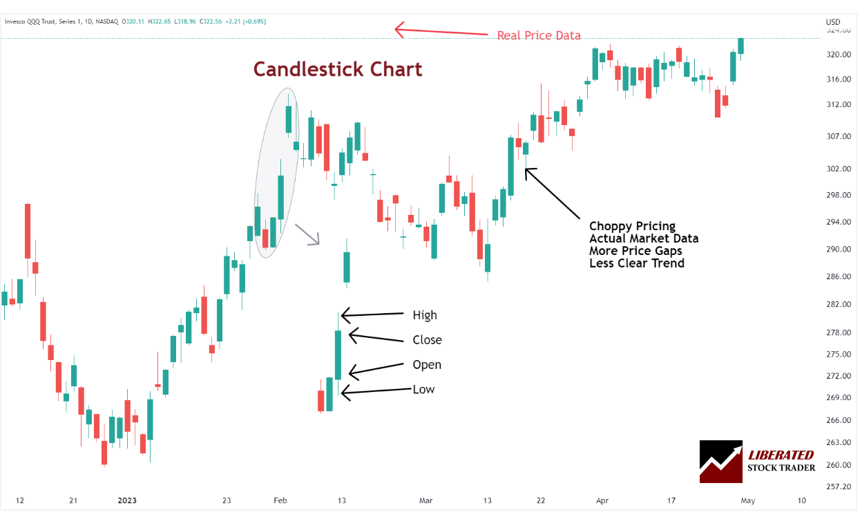
- Open: The first traded price in the new bar
- High: The highest price point within the bar’s trades
- Low: The lowest price point within the bar’s trades
- Close: The final traded price in the bar
- Volume: This can refer to the total number of shares or contracts traded within each tick bar
For instance, if a trader sets a 100-tick chart, each bar represents 100 trades. A new bar will commence once the 101st trade occurs.
Interpreting the Tick Chart Data
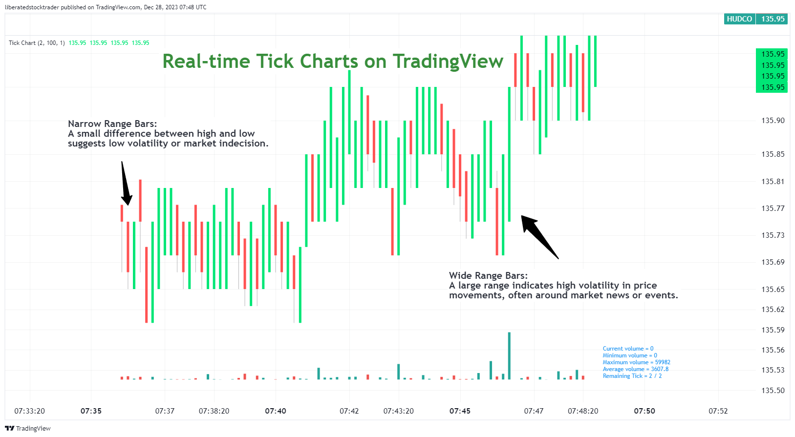
Interpreting tick chart data requires understanding the price movement and market conditions that can be inferred from the charts. Each bar can tell a story about market sentiment:
- Narrow Range Bars: A small difference between high and low might suggest low volatility or market indecision.
- Wide Range Bars: A large range indicates significant price movements, often around market news or events.
Traders also observe the open and close of each bar to gauge the market’s direction:
- A bar that closes higher than it opened may indicate buying pressure.
- Conversely, if it closes lower, it may suggest selling pressure.
Additionally, by assessing how many bars it takes for the market to reach a certain price level, traders can get a sense of the market’s momentum and liquidity conditions. This analytical process, called tick chart analysis, helps traders make informed decisions on market entry and exit points.
Tick Charts in Day Trading
Tick charts offer several advantages to day traders. Firstly, they provide a more granular transaction-based view of market movements. They produce more bars during periods of high activity and fewer during periods of low activity. This allows day traders to observe and react to market shifts more quickly and effectively.
Another benefit is the reduction of noise. Tick charts filter out periods of low volume that might not indicate a true market direction. This focus can help traders better identify significant trends and reversals. Lastly, for those trading futures contracts like the ES (E-mini S&P 500) or YM (E-mini Dow), tick charts can help pinpoint more precise entries and exits, which is crucial for the rapid-fire nature of a day trading strategy.
Common Tick Chart Time Frames for Day Trading
In day trading, tick chart time frames must be customized for each traded instrument. For example, a 133-tick chart is popular among traders as it represents a moderate number of transactions before a new bar is formed. Such a time frame allows day traders to see subtler shifts in market sentiment before they’re reflected in larger time frames. Conversely, some may opt for a 233-tick chart, which balances too much detail and not enough, making it an ideal “middle ground” for many trading strategies.
These time frames are not set in stone and often depend on the liquidity of the asset being traded. A highly liquid asset like the ES might warrant a higher tick size because of the large volume of trades. This quantity of data can give a more continuous stream of information for day traders to analyze.
Strategies and Patterns
Trading with tick charts offers unique opportunities to identify trends and patterns within the market. Traders can gain insights into market momentum and volatility by focusing on transactions rather than time. Let’s explore effective strategies and patterns that can be discerned using tick charts.
Identifying Support and Resistance on Tick Charts
Traders utilize tick charts to pinpoint precise support and resistance levels. These levels signify where price movements stall or reverse due to a concentration of demand (support) or supply (resistance). When the number of transactions in a single direction saturates, a horizontal line often represents a support or resistance level.
Recognizing Breakouts and Reversals with Tick Charts
Breakouts occur when the price moves beyond a defined support or resistance level, signaling a potential trend. Tick charts help traders clarify these pivotal moments by showing a surge in transaction volume that accompanies a breakout. Conversely, potential reversals are characterized by a sudden deceleration in transaction volume at a peak or trough, indicating a possible change in price direction.
The Role of Tick Charts in Scalping
Scalping is a trading style characterized by making many trades to capture small profit increments from security price changes. Tick charts are invaluable for scalpers, as each bar represents volume and price movements, allowing traders to pinpoint entry and exit points during fast-paced trading sessions.
Technical Analysis Using Tick Charts
Tick charts are invaluable tools for traders conducting technical analysis. They offer a detailed view of market movements and trader activity. This alternative to time-based charting emphasizes the completion of transactions over periods, providing unique insights, especially in assessing market volatility and momentum.
Indicators and Setups
Traders can utilize indicators with tick charts, but the efficacy and success rates must be verified with backtesting. Indicators, such as moving averages and the Relative Strength Index (RSI), can be applied to observe momentum and market strength, but will show differing results based on the tick size.
Tick Charts and Volume Analysis
Volume plays a crucial role in confirming the strength behind a price movement. On tick charts, traders often integrate a volume indicator to visualize the trade’s force. A new bar is formed for every specified number of transactions — known as ticks — thus, analyzing these ticks alongside volume can offer a more granular look at the market’s pulse.
Moreover, tick charts reveal changes in market volatility in a more nuanced manner. This granular visualization can be particularly useful when assessing the validity of a momentum-driven move. A surge in tick activity and high volume may indicate a strong move, offering traders a clearer signal amidst the market noise.
Liquidity and Tick Charts
The relationship between liquidity and tick charts is critical. When a market is highly liquid, there are many ticks because transactions are being executed frequently. This leads to a detailed tick chart that gives real-time insight into the buying and selling pressure. Conversely, in markets with low liquidity, tick charts may reveal gaps or clusters, indicating slippage potential—where the execution price of a trade is different from the expected price due to a lack of available orders.
Institutional Investors and Tick Chart Insights
Tick charts can also provide a window into the activities of institutional investors. Large transaction volumes, typically associated with these market participants, can create distinct patterns on tick charts. Savvy traders use this information to infer whether institutions are accumulating or distributing positions, which can signal significant upcoming price movements. Identifying these patterns early can be a meaningful advantage in aligning one’s trading strategy with powerful market movers.
Alternatives to Tick Charts
Selecting the right chart type is crucial for successful trading. Different charts provide various perspectives on market data, each suited to particular trading styles and objectives.
Heikin Ashi Charts
Based on our comprehensive testing, Heikin Ashi (HA) charts have demonstrated superior performance. By incorporating recent price action, they offer more reliable and smoother data points than traditional candlestick charts. Consequently, they prove to be highly beneficial for traders seeking potential trading signals and long-term investors aiming to validate their investment strategies.
Japanese Candlestick Charts
Candlestick charts allow traders to quickly identify potential patterns in the market, which can help them decide when to enter or exit a trade. For example, if a pattern appears where the upper shadow is consistently larger than the lower shadow, then this could indicate that buying pressure is increasing. Candlestick charts have proven success rates according to our testing. This makes them more reliable for day trading than tick charts.
Renko Charts
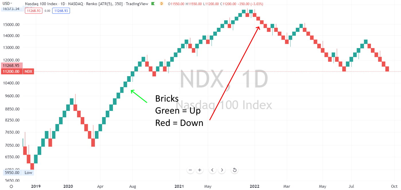
Renko charts help traders filter out minor price movements, as they are constructed only when the price moves by a predetermined price.
Renko charts are created by placing a brick in the next column once the price moves a predetermined amount from the previous brick. The size of the move is called the “box size.” Renko charts can identify trends, support and resistance levels, and potential buy and sell signals.
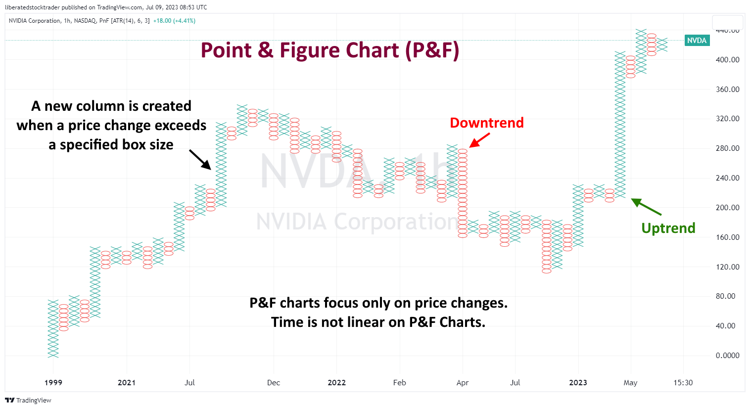
Point & Figure Charts
Point and Figure charts use ‘Xs and ‘Os’ to represent price movements. ‘X indicates an increase, while ‘O’ indicates a decrease. They are great for identifying support and resistance levels, regardless of time or volume. They are perfect for spotting long-term trends!
Conclusion
Tick charts are a valuable tool for day traders who value precision and the ability to see real-time market momentum. They differ fundamentally from time-based charts by aggregating price movements into bars that form after a specified number of transactions, or ticks, have occurred, regardless of the time it takes to execute these transactions.
FAQ
How do you interpret tick charts for effective trading?
Tick charts allow traders to observe transaction frequency and price volatility by plotting transactions after a certain volume of trades has occurred. To interpret them effectively, one should look for patterns that indicate high activity and potential trend shifts, as these are often precursors to substantial price movements.
What are the optimal tick chart settings for day traders?
The optimal tick chart settings for day traders typically involve smaller tick sizes—usually between 200 to 500 ticks—that align with their trading strategy and the liquidity of the market they are trading. Lower tick settings can provide a granular view of market movements, which is essential for quick trades.
Can tick charts improve your scalping techniques?
Tick charts can be useful for scalping, as they show small price fluctuations and allow scalpers to identify entry and exit points with greater accuracy. By focusing on micro-movements, traders can react to short-term price changes.
What indicators complement tick chart analysis for traders?
Indicators such as moving averages, Bollinger Bands, and the Relative Strength Index (RSI) can complement tick chart analysis by providing additional context to the tick data. These indicators help traders distinguish between noise and meaningful market moves.
How does tick size impact trading strategy with real-world examples?
Tick size impacts a trading strategy by determining the granularity of the price movements a trader can observe. For instance, a smaller tick size may benefit a day trader looking at S&P 500 E-mini futures by allowing them to see smaller price changes. In contrast, a larger tick size can filter out market noise for a clearer trend analysis.