Believe it or not, chart price patterns really work. Not all of them, just a specific set of patterns, have proven to be reliable and profitable over time.
Research shows that the most reliable chart patterns are the Head and Shoulders (89% success rate), the Double Bottom (88%), and the Triple Bottom and Descending Triangle (87%). The Rectangle Top is the most profitable, with an average win of 51%, followed by the Rectangle Bottom with 48%.
Chart Pattern Reliability & Profitability Results
This table shows the chart pattern success rate/probability of a price increase in a bull market and the average price increase after emerging from the pattern. For example, the inverse head and shoulders pattern has an 89% success rate when price moves up through the resistance level, with an average gain of 45%.
| Reliable Chart Patterns | Success Rate | Average Price Change |
| Inverse Head & Shoulders | 89% | 45% |
| Double Bottom | 88% | 50% |
| Triple Bottom | 87% | 45% |
| Descending Triangle | 87% | 38% |
| Rectangle Top | 85% | 51% |
| Rectangle Bottom | 85% | 48% |
| Bull Flag | 85% | 39% |
| Ascending Triangle | 83% | 43% |
| Rising Wedge | 81% | 38% |
| Head-and-shoulders top* | 81% | -16% |
| Rectangle Bottom* | 76% | -16% |
| Falling Wedge | 74% | 38% |
| Pennant Patterns (Avoid) | 46% | 7% |
Performance Data Courtesy of thepatternsite.com, permission granted by Tom Bulkowski. *Figures for a downward break through the support line – bearish trade.
These patterns are formed by stock price movements on a chart and can provide valuable insights into future price movements.
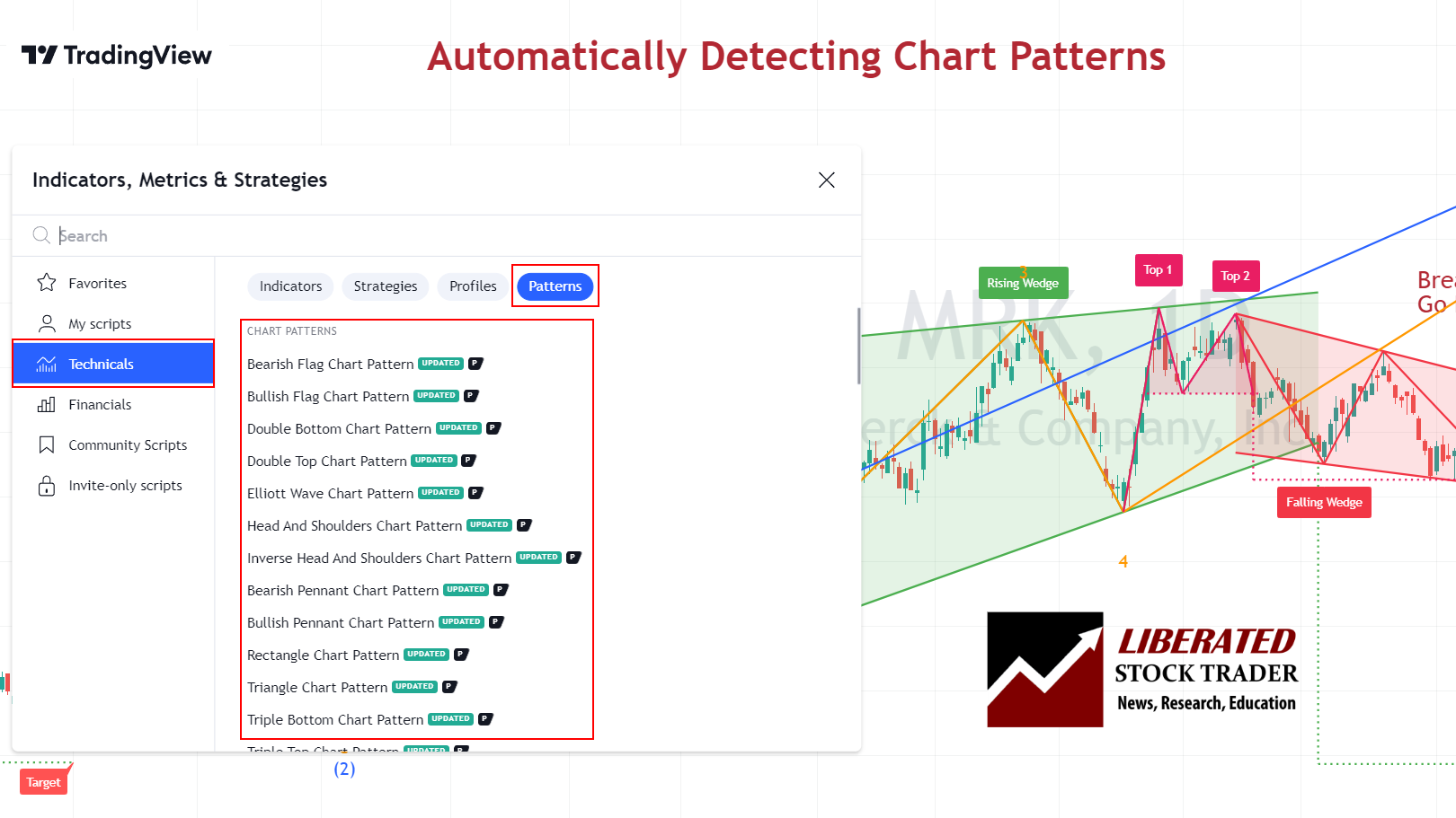
Identifying Chart Patterns
Traditionally, identifying chart patterns, drawing trendlines, and plotting target prices required manual effort. However, with the advent of TradingView, most chart patterns can now be automatically detected, streamlining the analysis process for professionals. TradingView is the number one charting service in the world and is loved by Liberated Stock Trader readers.
1. Inverse Head & Shoulders – 89% Success
| Chart Pattern | Success Rate | Average Price Change |
| Inverse Head and Shoulders | 89% | +45% |
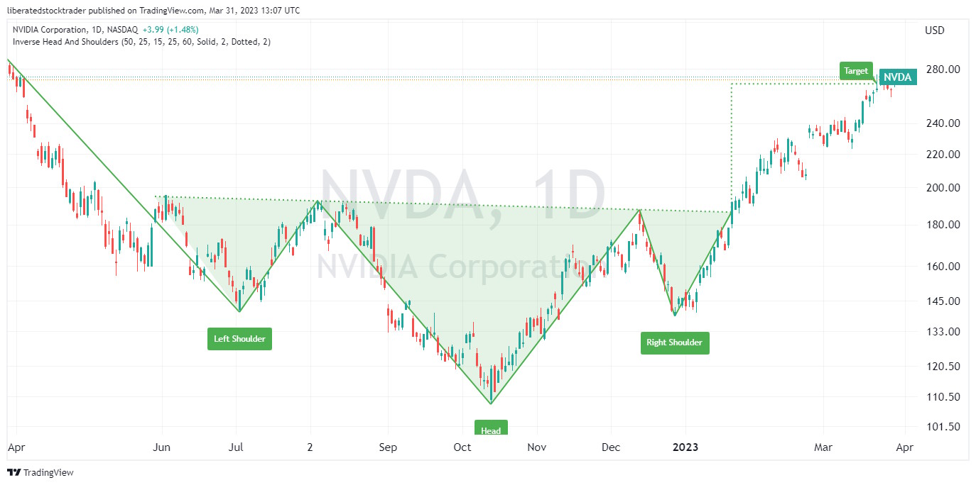
Identifying an Inverse Head and Shoulders
To identify an inverse head and shoulders pattern, look for three distinct lows in the security’s price on intraday, daily, and weekly charts. The middle low (head) should be significantly lower than the other shoulders. Look for a confirmation of a trend reversal by watching for a breakout either above the upper resistance line or below the lower support line.
If the security price breaks out above the resistance line, it could signal that the security has completed its reversal. In contrast, a break below the support line could signal a resumption of the downtrend.
2. Double Bottom – 88% Success
A double-bottom chart pattern has an 88% success rate on a reversal of an existing downtrend. When the price breaks through resistance, it averages a 50% price increase; the only pattern better than this is a cup and handle.
The double bottom occurs when the security price hits the bottom twice, creating a “W”-shaped pattern. This pattern often indicates that the stock’s price could soon increase. However, this indicator does not guarantee a reversal in direction.
| Chart Pattern | Success Rate | Average Price Change |
| Double Bottom | 88% | 50% |
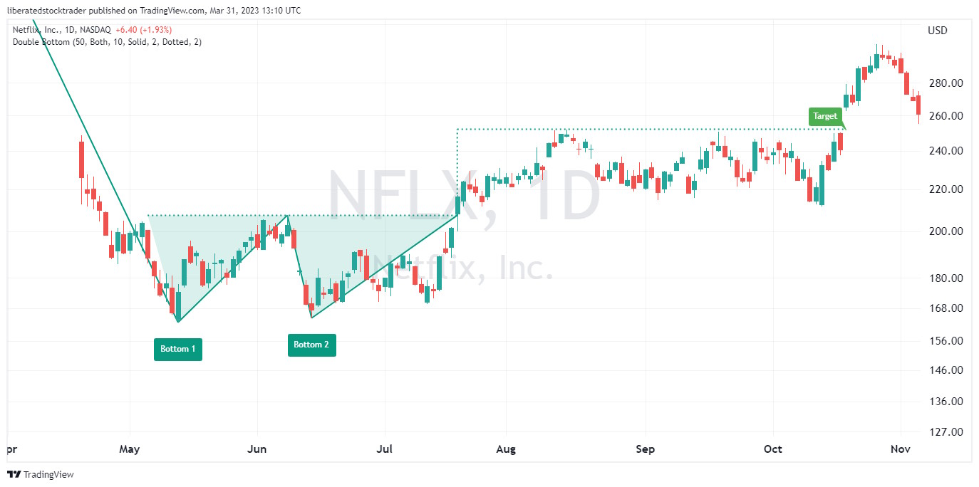
Identifying a Double-Bottom
To identify a double bottom chart pattern, investors should look for two distinct lows in the security’s price that form a “W”-shaped pattern. Generally, the pattern should be visible on an intraday and daily chart. After identifying the two bottoms, investors can look for confirmation of a trend reversal by watching for a breakout either above the upper resistance line or below the lower support line.
If the security price breaks out above the resistance line, it could signal that the security has completed its reversal. In contrast, a break below the support line could signal a resumption of the downtrend. It should be noted that further confirmation of this stock chart pattern should not be relied upon until after prices have moved beyond these levels.
TradingView 4.8/5⭐ : The Best Trading Platform I’ve Tested in 20+ Years
With lightning-fast charts, powerful pattern recognition, smart screening, backtesting, and a global community of 20+ million traders — it’s a powerful edge in today’s markets.

If you want one platform that gives you an edge, this is it.
3. Triple Bottom – 87% Success
A triple bottom chart pattern indicates the potential for a reversal of an existing downtrend with an 87% probability of success and an average 45% price increase.
A triple bottom occurs when the price hits the bottom three times, creating a “VVV”-shaped pattern. This pattern often indicates that the asset price could soon begin to increase.
| Chart Pattern | Success Rate | Average Price Change |
| Triple Bottom | 87% | 45% |
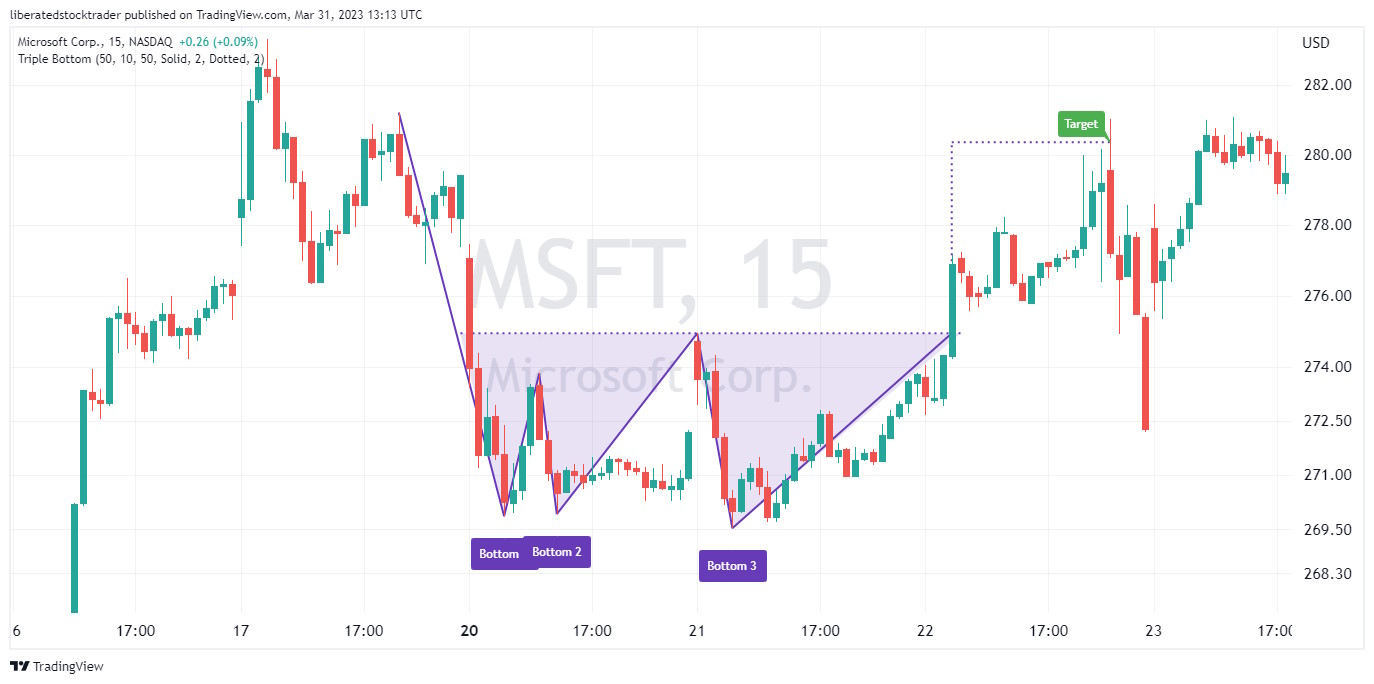
Identifying a Triple Bottom
To identify this stock chart pattern, investors should look for three distinct price lows forming a “WV”-shaped pattern. The pattern should generally be visible on a daily and weekly chart. After identifying the three bottoms, investors can look for confirmation of a trend reversal by watching for a breakout either above the upper resistance line or below the lower support line.
If the security price breaks out above the resistance line, it could signal that the security has completed its reversal. In contrast, a break below the support line could signal a resumption of the downtrend.
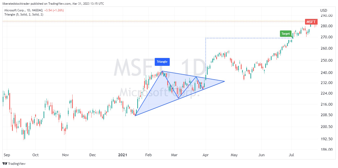
4. Descending Triangle – 87% Success
A descending triangle chart pattern highlights the potential for a reversal or continuation of an existing downtrend. When the price breaks up through resistance, there is an 87% chance of success, with an average profit of 38%.
A descending triangle occurs when the price forms two downward-sloping trendlines that converge towards each other, creating a triangle-shaped pattern pointing downwards. This pattern can indicate that the security’s price could soon begin to move higher.
| Chart Pattern | Success Rate | Average Price Change |
| Descending Triangle | 87% | 38% |
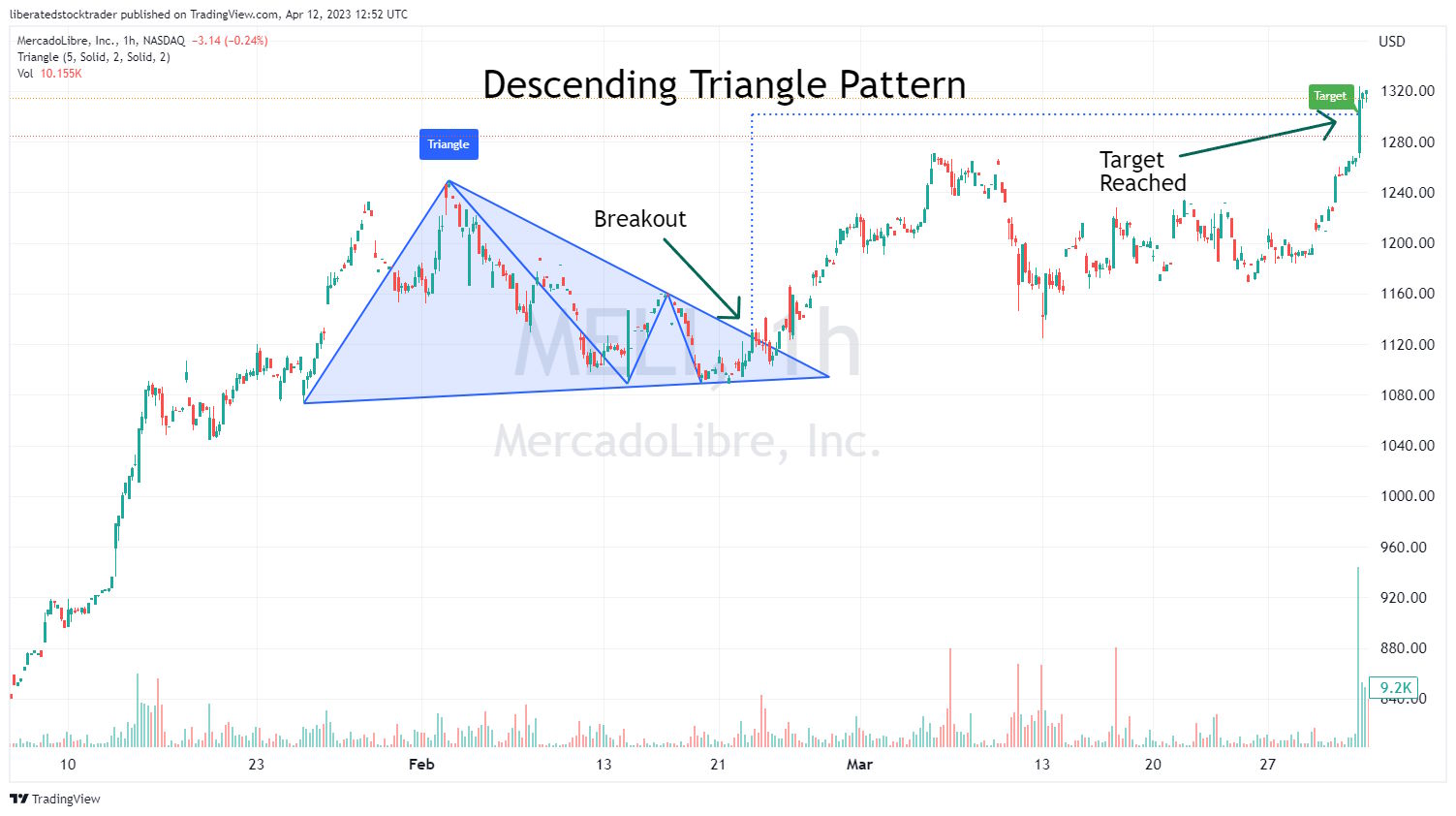
Identifying a Descending Triangle
To identify a Descending Triangle chart pattern, investors should look for two downward-sloping trendlines that form a descending triangle. The pattern should generally be visible on intraday and daily charts.
After identifying the two trendlines, investors can look for confirmation of a trend reversal by watching for a breakout either above the upper resistance line or below the lower support line. If the security price breaks out above the resistance line, it could signal that the downtrend is now over, while a break below the support line could signal the continuation of the trend.
5. Rectangle Top – 85% Success
This typically occurs after an uptrend, as investors become less aggressive in bidding the price up. A rectangular top pattern can signify that the upward trend may soon end and could be followed by a sharp decline. The pattern is sometimes called a trading range, flat top, or rectangular formation.
| Chart Pattern | Success Rate | Average Price Change |
| Rectangle Top | 85% | 51% |
Identifying a Rectangle top
To identify a rectangle top chart pattern, investors should look for two parallel and horizontal lines forming a rectangle. Generally, the pattern should be visible on an intraday and daily chart. The upper resistance line should identify when the security’s price struggles to move higher, and the lower support line should identify when the security’s price fails to decline further. Once these two lines have been identified, investors can look for a breakout either above the upper resistance line or below the lower support line.
If the security price breaks above the upper trendline, it could signal a resumption of its uptrend. In contrast, a break below the lower trendline could signal a potential downtrend.
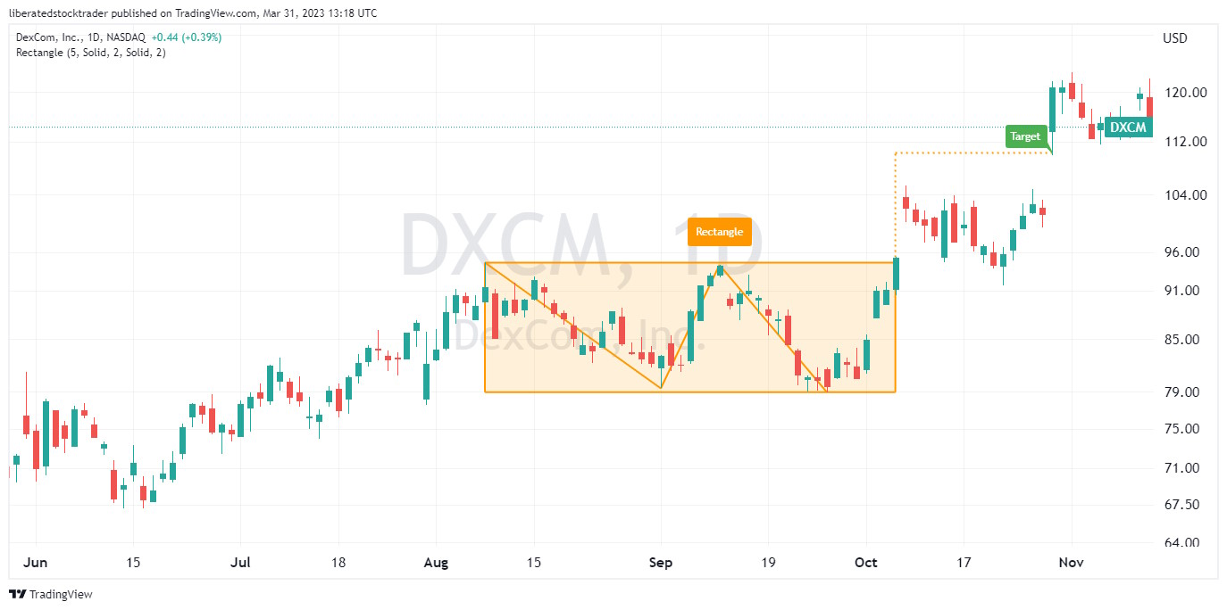
6. Rectangle Bottom – 85% Success
| Chart Pattern | Success Rate | Average Price Change |
| Rectangle Bottom | 85% | 48% |
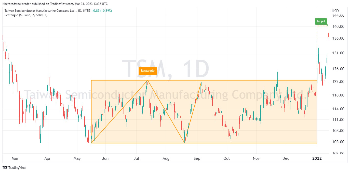
Identifying a Rectangle Bottom
Investors should look for at least four bounces off the support and resistance lines to identify this stock chart pattern. The pattern should generally be visible on an intraday and daily chart.
7. Bull Flag – 85% Success
A high tight bull flag chart pattern suggests the potential for a continuation or reversal of an existing uptrend. When the price breaks through resistance, there is an 85% probability of success, with an average profit of 39%.
It occurs when the price of a security rises sharply, followed by a period of consolidation in which prices move within two parallel trendlines. This pattern can indicate that the security’s price may soon move higher or lower, depending on the direction of the breakout.
| Chart Pattern | Success Rate | Average Price Change |
| High Tight Bull Flag | 85% | 39% |
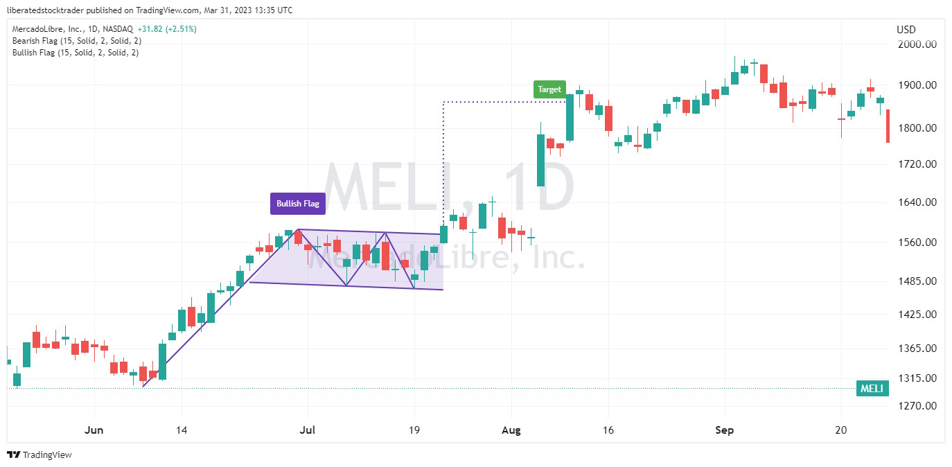
Identifying a High-Tight Bull Flag
To identify a high-tight bull flag pattern, investors should look for a sharp price rise followed by two parallel trendlines forming an ascending triangle. Generally, the pattern should be visible on intraday and daily charts. After identifying the two trendlines, investors can look for confirmation of a trend reversal by watching for a breakout either above the upper resistance line or below the lower support line.
If the security price breaks out above the resistance line, it could signal that the security resumed its uptrend, while a break below the support line could signal a downtrend.
8. Ascending Triangle – 83% Success
Similarly, if the market was in a downtrend before forming an ascending triangle, a break below the lower trendline could signal a continuation of the downtrend.
| Chart Pattern | Success Rate | Average Price Change |
| Ascending Triangle | 83% | 43% |
Identifying an ascending triangle
The ascending triangle is formed when an upward-sloping support line and a flat resistance line create a triangle shape with its apex pointing upwards. By watching for breakouts above or below these lines, investors can gain insight into whether prices will continue their current trend or reverse direction.
9. Rising Wedge – 81% Success
| Chart Pattern | Success Rate | Average Price Change |
| Rising Wedge | 81% | 38% |
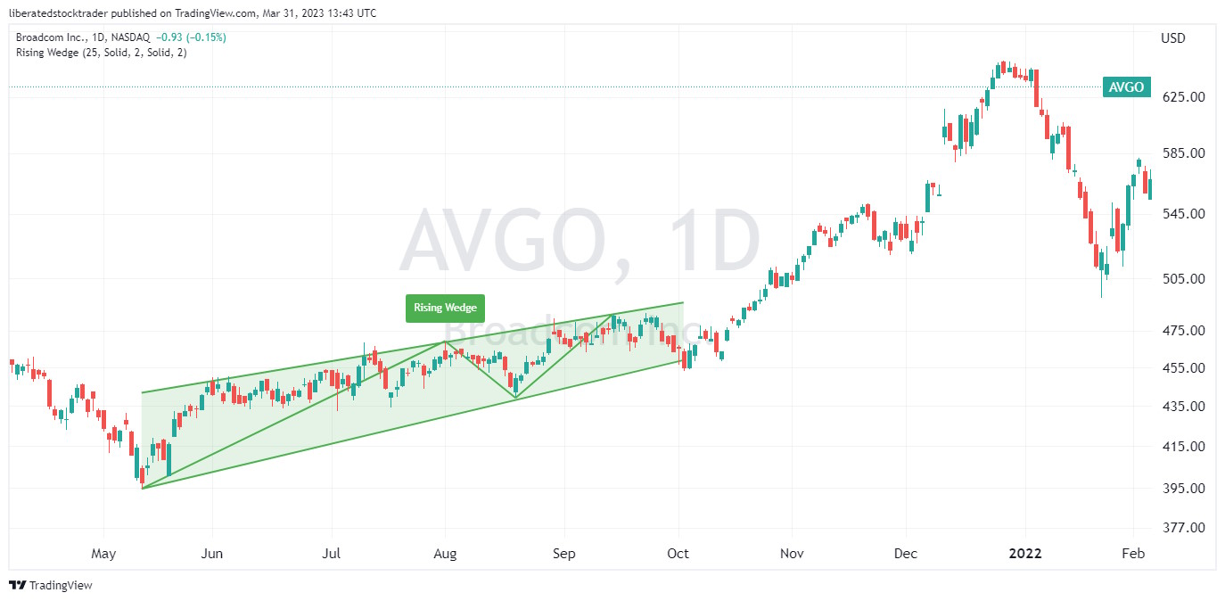
Identifying a Rising Wedge
To identify this stock chart pattern, investors should look for two upward-sloping trendlines that form an ascending triangle. Generally, the pattern should be visible in intraday and daily charts. After identifying the two trendlines, investors can look for confirmation of a trend reversal by watching for a breakout either above the upper resistance line or below the lower support line.
If the security price breaks out above the resistance line, it could signal that the uptrend is continuing, while a break below the support line could signal a reversal and that prices are likely to move lower.
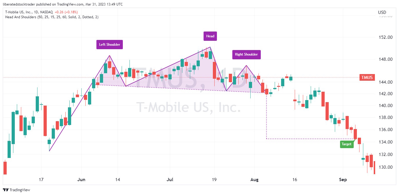
10. Head & Shoulders Top – 81% Success
| Chart Pattern | Success Rate | Average Price Change |
| Head & Shoulders Top | 81% | -16% |
Auto-detect this Chart Pattern with TradingView
Identifying a Head & Shoulders Top
To identify this stock chart pattern, investors should look for three distinct price peaks forming a head-and-shoulders pattern on intraday, daily, and weekly charts. After identifying the three peaks, investors can look for confirmation of a trend reversal by watching for a breakout either above the upper resistance line or below the lower support line.
If the security price breaks below the support line, it could signal that the reversal is complete. In contrast, a break above the resistance line could signal a resumption of the uptrend. It should be noted that further confirmation of this stock chart pattern should not be relied upon until after prices have moved beyond these levels.
11. Bearish Rectangle Bottom – 76% Success
A bearish rectangle bottom chart pattern with a downward breakout indicates the continuation of an existing downtrend, with a 76% probability and an average gain of -16% when shorting.
| Chart Pattern | Success Rate | Average Price Change |
| Bearish Rectangle Bottom | 76% | -16% |
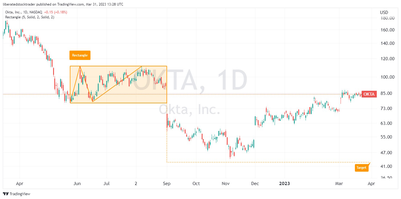
Identifying a Rectangle Bottom
The rectangle bottom occurs when the price of a security forms two nearly flat trendlines that create a rectangle-shaped pattern, with one trendline connecting the highs and the other connecting the lows. This pattern is found during a downtrend; if the price breaks lower through the support line, the downtrend will continue. While a bearish rectangle has a solid success rate, the inverse cup and handle pattern is even better for short sellers.
12. Falling Wedge – 74% Success
| Chart Pattern | Success Rate | Average Price Change |
| Falling Wedge | 74% | 38% |
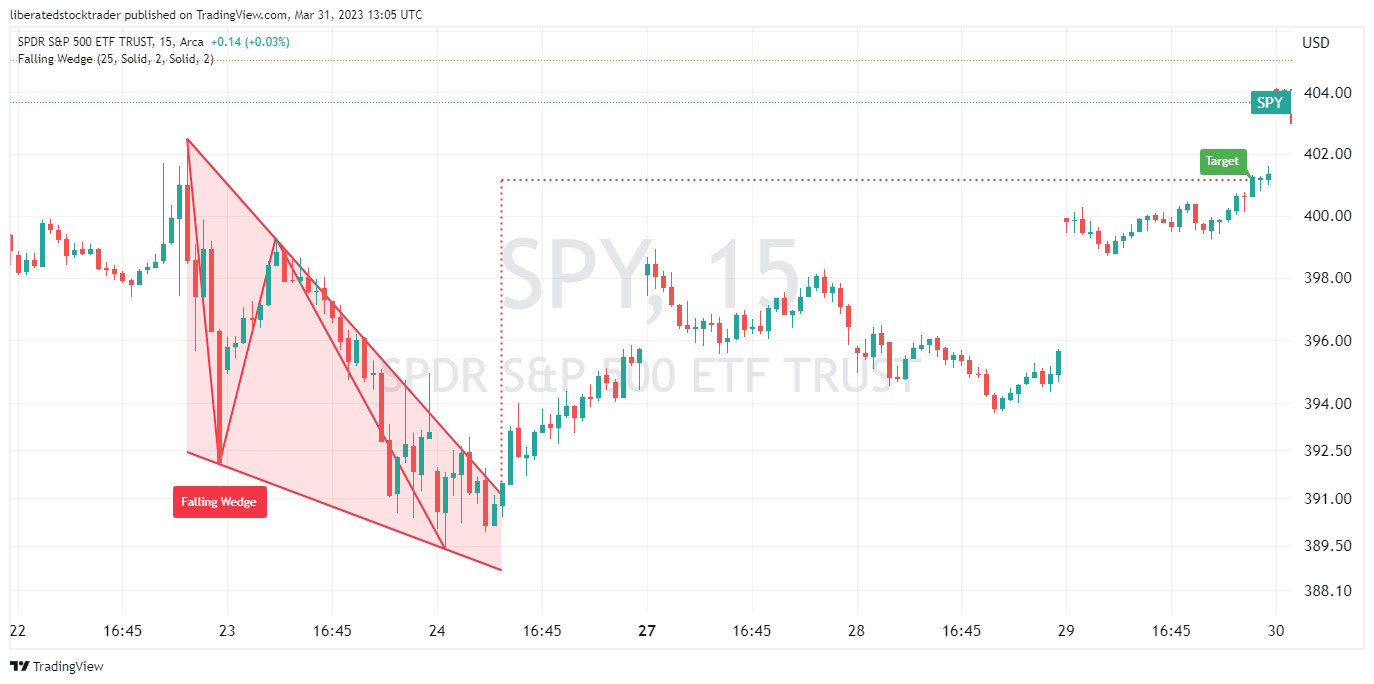
Identifying a Falling Wedge
To identify a Falling Wedge stock chart pattern, investors should look for two converging trendlines that form a descending triangle. The pattern should generally be visible on intraday and daily charts. After identifying the two trendlines, investors can look for confirmation of a trend reversal by watching for a breakout either above the upper resistance line or below the lower support line.
If the security price breaks out above the resistance line, it could signal that the security has completed its reversal. In contrast, a break below the support line could signal the continuation of the downtrend.
Warning – Avoid the Pennant Pattern
A pennant continuation pattern identifies a trend continuation, but it is an extremely bad indicator. Although many tout the Pennant pattern, Tom Bulkowski warns against using it, as it has only a 46% success rate and a meager 7% average profit.
The Pennant occurs when the price of a security forms two converging trendlines that create a symmetrical triangle-like pattern, often referred to as a “pennant.” This pattern suggests that the security’s current trend is likely to continue.
| Chart Pattern | Success Rate | Average Price Change |
| Pennant Patterns (Avoid) | 46% | 7% |
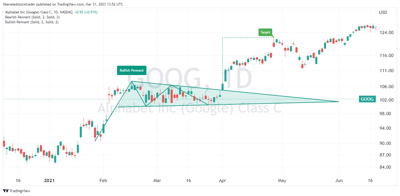
Due to its poor performance, I do not recommend using the bullish or bearish pennant chart pattern for trading.
Summary
Thanks to this research, we have proof that chart patterns work. Each of these twelve reliable and profitable chart patterns has a greater than 80% chance of success with an average profit potential of 38% to 51%.
Believe it or not, there are chart patterns with even better success and profitability track records. Also, I have discussed only the success rate of these patterns in bull markets, but what about bear markets? All the research is revealed in Tom Bulkowski’s Encyclopedia of Chart Patterns. Incredible detail and a visual listing of these patterns are available at ThePatternSite.com.
FAQ
Do chart patterns really work?
Yes, chart patterns really work. According to decades of research, chart patterns work between 50 and 89%, depending on the pattern and the market. For example, a double bottom pattern in a bull market is predictive, with an accuracy of 88% and an average price change of +50%.
What is the most successful chart pattern?
The inverse head-and-shoulders pattern is proven to be the most successful chart pattern in a bull market, with an 88% accuracy rate and an average price change of +50%. Other successful patterns include the double bottom (88%) and the ascending triangle (83%).
What is the most reliable pattern in trading?
According to decades of testing, one of the most reliable patterns in trading is the rectangle top, with an 85% chance of success and an average of 51% profit in a bull market. This pattern has been tested and documented in the Encyclopedia of Chart Patterns by Tom Bulkowski.
What is the psychology behind chart patterns?
Chart patterns reflect the psychology of market participants and how they perceive a security’s value. Chartists use these patterns to determine when buyers or sellers are in control, which can help identify potential reversals or breakouts. Chartists look for trends in price and volume that signal the current state of market sentiment.
How many chart patterns are there?
According to the Encyclopedia of Chart Patterns by Tom Bulkowski, 82 distinct chart patterns across bull and bear markets have been identified, documented, and tested. You can either learn each chart pattern or use pattern recognition software to do the work for you.
Why do patterns fail in trading?
Successful patterns fail in trading because market sentiment can change quickly. Even when a pattern is progressing perfectly, breaking financial news can disrupt the market and cause it to fail. Even a successful pattern can fail if there is market-moving news, such as Federal Reserve interest hikes or an industry-impacting announcement.
What is the easiest pattern to trade?
The easiest pattern to trade is the rectangle or Darvas Box. This is a chart pattern where the stock makes a series of highs and lows within a boxed price range. When the stock breaks out of this range, it can signal either an uptrend or a downtrend. Experienced traders look for volume expansion when trading these patterns to confirm that the breakout is legitimate.
Learn the Success Rates of 65 Chart Patterns
The Encyclopedia of Chart Patterns by Tom Bulkowski details the reliability and success rates of 65 chart patterns and shows you how to trade them. It is an indispensable resource for traders and investors seeking to enhance their profitability by leveraging stock chart patterns. This comprehensive reference book provides in-depth explanations and detailed illustrations of over 65 different patterns, including Head and Shoulders, Double Tops, Wedges, Flags, Gaps, and more.

Thanks Michael for your kind comments and feedback. When I update this articles, I will look at expectancy.
thanks Barry
I am enjoying reviewing your written articles and also a big fan of Thomas Bulkowski and his many books on Western & Eastern price patterns, especially under varying market conditions! As to your topic on ‘Western’ patterns, ranking them by ‘Success Rate’ is one approach, but drawing upon my MBA days, there is a more accurate approach called “Expected Value Theory” (EVT) that also includes the results of both Wins and Losses to more accurately reflect the expected ‘overall’ results by continuously following a strategy. The EVT formula combines the following, (Success Rate of Wins [%] * Average Price Change of Wins [%]) – (Unsuccess Rate of Losses [%] * Average Price Change of Losses [%]). The preceding formula looks at the results of both Wins and Losses to provide a better (realistic) statistic in measuring a strategy, especially if the Losses tend to be biggiers versus the Wins! Applying this EVT formula would likely change the rankings of several of the above patterns. This is also one of my personal measures in assessing experts in the investing-trading field as many haven’t heard of it and tend to flaunt their winners without including the losses.
Hi Charlie, the steps forward in technical analysis and automated pattern recognition mean new insights are coming thick and fast. Thanks for the comment.
I found this article incredibly informative, I had no idea that deep research has been done on chart patterns. Impressive that they actually work according to data. Thanks