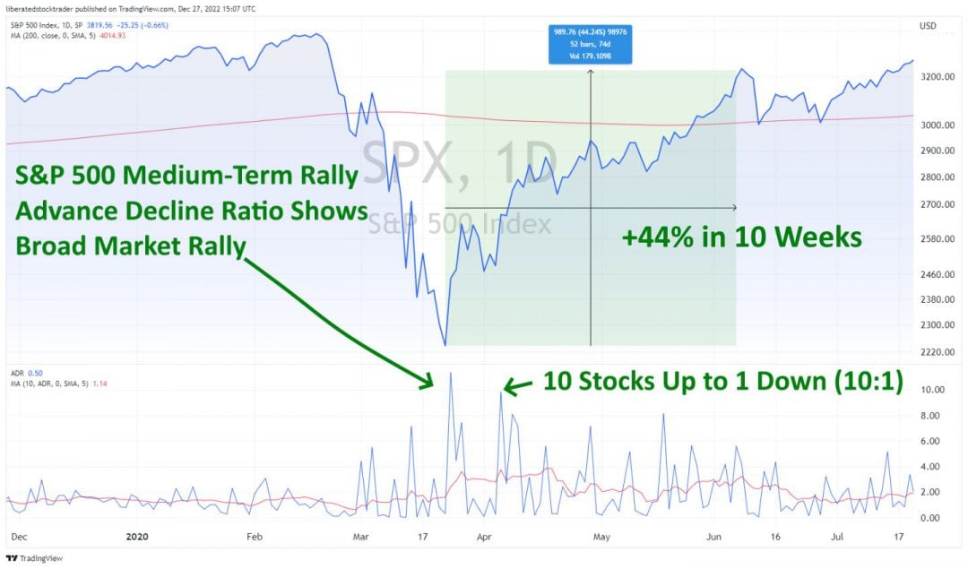
There is more than one way to skin a cat, goes the old saying; quite why someone would want to skin a cat is beyond comprehension. Like the skinning of cats, there is more than one way to picture the supply and demand situation of the stock market with stock charts.
Stock charts come in many shapes and sizes, from the differences in the bars to the different concepts applied to the chart itself. Here, you will find a reference guide to the core four charts with an overview of their potential uses.
Line Stock Chart
The line stock chart is the most basic, providing the least information. The line in the top pane is drawn using the close price for each unit of time. So, if this is a daily line chart, the close price for the day is used. If this is a 5-minute chart, then the close price for every 5 minutes of trading is used.
The Positives of Line Stock Charts
It is a very simple view of the price movement. It is good to use when comparing many stocks on the same chart.
The Negatives of Line Stock Charts
The line stock chart does not show the Price Open / High / Low for the trading period. The trading range for the day is important in price-based decision-making.
High Low Close Bar Chart (HLC)
The HLC chart uses bars, which is a step up from the line chart, as it allows us to plot additional useful data. Here, each bar represents a trading period with the prices High, Low, and Close represented.
The Positives of the HLC Bar Chart
More information is available, showing the range of the day’s trading, enabling you to see the day’s trading range instantly.
The Negatives of the HLC Bar Chart
No opening price is reflected in this chart. The opening price is important as it lets us see immediately if the price gapped up or down on the open and where the closing price is relative to the opening price.
Open High Low Close Bar Chart (OHLC)
The OHLC bar chart is a complete chart of choice for those who want to see the full information. Here, we see the range of the day’s trading, including the opening price, the high and low for the day, and the closing price.
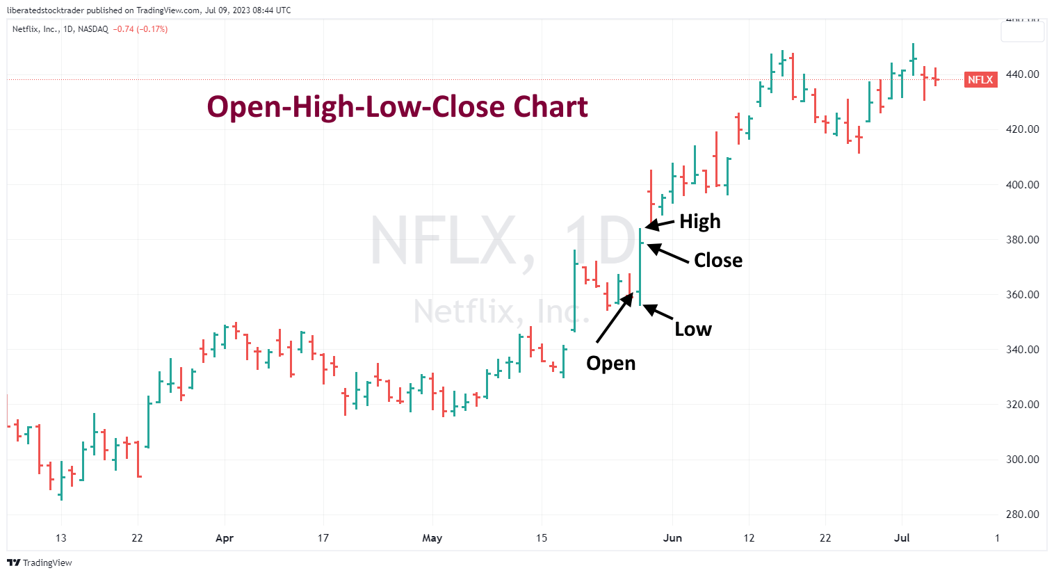
The Positives of the OHLC Chart
We can see instantly if the trading period closed higher or lower than the open. We can also see the length of the bar, which shows us the trend’s volatility or strength.
The Negatives of the OHLC Chart
The OHLC chart has a few downsides, but many investors and traders use it. Most chart packages also allow you to color the up days green and the down days red. The Candlestick chart can also be used for those who prefer even more information in the price chart.
Japanese Candlestick Charts
Used widely in Japan and gaining a strong foothold in the rest of the world, the Japanese Candlestick chart gives an excellent insight into current and future price movements.
They are named candlesticks because they look like candlesticks with a wick and a main body. This is essentially the same as an OHLC chart, but is a little more graphical and enables easier recognition of short-term patterns.
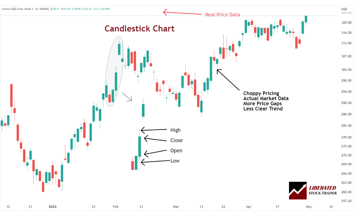
The Positives of Candlestick Charts
Candlesticks give an excellent view of the Open, High, Low, and close prices. They are pictorially illuminating and easy to see trends. A full reference of 1-bar to 4-bar patterns helps us judge the future price direction. They connect psychology with the price pattern.
The Negatives of Candlestick Charts
Although Candlesticks have many advantages, they can seem like information overload to the beginner, as there are so many candlestick patterns to learn.
Further Reading
Please read 9 Different Types of Stock Charts: Pros & Cons With Examples for a more advanced and detailed lesson on stock chart types.