Equivolume is a technical analysis chart that displays the volume of trading activity and price movements in a single bar.
Equivolume charts work by plotting each day’s trading volume as a vertical bar, with the width representing the total number of shares traded that day. The price action is displayed at the height of the bar, creating a unique visual representation of both price and volume data.
Equivolume charts have lost their popularity over time due to poor testing performance and weak data visualization. I demonstrate why equivolume is no longer used and introduce six charts that have been proven superior by data.
What are Equivolume Charts?
Equivolume charts are unique trading charts that combine price and volume information into each data point, visually represented as rectangular bars.
Equivolume was developed by Richard W. Arms Jr. and was considered useful for locating periods that stand out in trading, such as high-volume days or periods of price volatility.
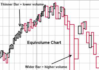
An Equivolume Chart Example
Equivolume charts aim to offer an alternative approach to visualizing volume at a given price. Instead of plotting volume in separate bars, it is incorporated into the price bars.
The wider the price bar, the more shares were traded during that period.
Equivolume charts aim to offer an alternative approach to visualizing volume at a given price. Instead of plotting volume in separate bars, it is incorporated into the price bars.
The wider the price bar, the more shares were traded during that period.
What is unique about Equivolume?
Equivolume charts uniquely combine volume data with price data. The y-axis in an equivolume chart reflects the price, and the x-axis reflects the volume traded for a given period. This chart type benefits traders by allowing them to analyze both price movements and trading activity, making it easier to interpret market sentiment.

Get Equivolume Charts on TradingView
The primary advantage of equivolume charts is that they combine price and volume data, enabling traders to more effectively identify trading opportunities and potential market trends. Furthermore, it allows traders to compare volume across different time frames.
8 Reasons to Avoid Equivolume Charts?
1. Inaccurate Price Data
A key criticism of equivolume charts is that they do not show a security’s open and close prices. This lack of information can lead to gaps in analysis, as the opening and closing prices are often significant indicators of market sentiment towards a particular security. For instance, if a stock opens at a high price and closes at a significantly lower price, it could indicate bearish market sentiment. Without this information, traders may miss out on important trends and patterns.
2. No Price Pattern Recognition
Additionally, equivolume charts don’t allow for the recognition of price patterns, which can be important when trading. Price patterns, such as channels, support, resistance levels, or trendlines, may not be easily identified on an equivolume chart because they are not visualized using this type of charting.
3. Overlapping Bars
The last disadvantage of equivolume charting is that it can be difficult to read due to the overlapping bars. This means that traders must exercise extra caution when analyzing the data, as it can be easy to overlook important details. Additionally, equivolume charts may not provide enough detail for some traders who require more granular analysis.
4. Inaccurate Timeline
Finally, equivolume charts don’t always provide an accurate timeline. This means that while the trader can get a general idea of what has been happening in the market, it may not be as detailed or precise as other charting types. Additionally, since equivolume charts do not account for short-term price fluctuations, traders must utilize other chart types to gain a better understanding of market dynamics.
5. Impossible to Backtest Strategies
Equivolume charts are also unsuitable for backtesting strategies since they provide insufficient information. Backtesting requires traders to examine past data and use it to develop a trading strategy, which is not possible with an equivolume chart. Additionally, the lack of an accurate timeline in the chart makes it difficult to automatically identify proven successful chart patterns or trends that could be used for backtesting.
6. Difficulty in Comparing Volumes Across Different Periods
Equivolume charts also make it difficult to compare trading volume during different periods, as there is no ability to measure the distance between price and time intervals. As a result, traders must use more detailed charting to accurately compare volumes across multiple periods.
7. The Best Charting Tools Do Not Support Equivolume
Equivolume charting is not supported by popular charting software vendors, such as TradingView, TrendSpider, or MetaStock, for a good reason: Equivolume provides no advantages to traders. Equivolume has been replaced with more advanced charts, such as Heikin Ashi, VWAP, Raindrop charts, and Candlesticks.
8. Limited Support for Technical Analysis Indicators
Finally, equivolume charts are not well-suited for technical analysis because of the limited number of indicators supported by the chart. For example, popular indicators such as Bollinger Bands, MACD histograms, and Moving Averages are not supported in equivolume charts. Therefore, traders must look to other forms of technical analysis to gain insight into markets.
My thorough testing awarded TradingView a stellar 4.8 stars!
With powerful stock chart analysis, pattern recognition, screening, backtesting, and a 20+ million user community, it’s a game-changer for traders.
Whether you're trading in the US or internationally, TradingView is my top pick for its unmatched features and ease of use.
Explore TradingView – Your Gateway to Smarter Trading!
6 Charts Proven Better than Equivolume
Equivolume may have been popular, but more advanced charting techniques have since replaced it. Here are three charts that are better suited than equivolume for technical analysis:
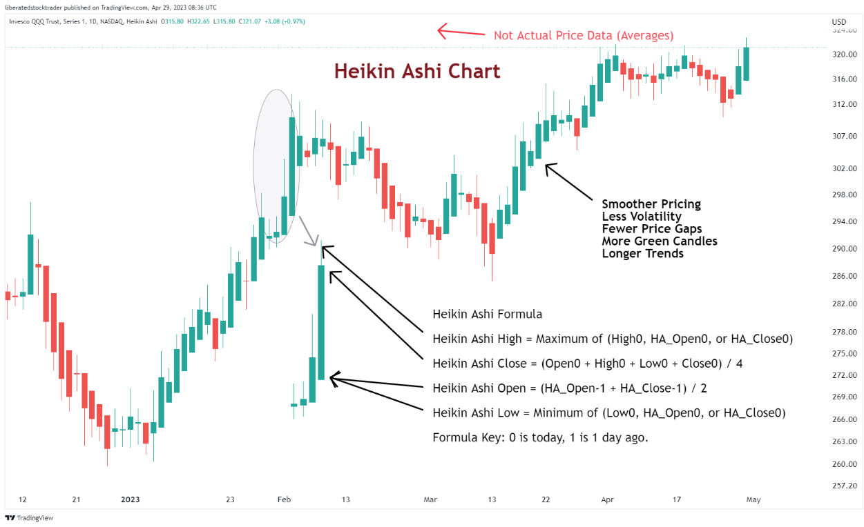
1. Heikin Ashi Charts
Heikin-Ashi charts are an alternative to candlestick charts. They smooth out price action and indicate a trend more clearly than standard candlesticks. The Heikin-Ashi technique comprises modified versions of open, high, low, and closing prices.
Get Heikin Ashi Charts on TradingView
Our testing of the Heikin Ashi chart conclusively proves its superior performance in trading.
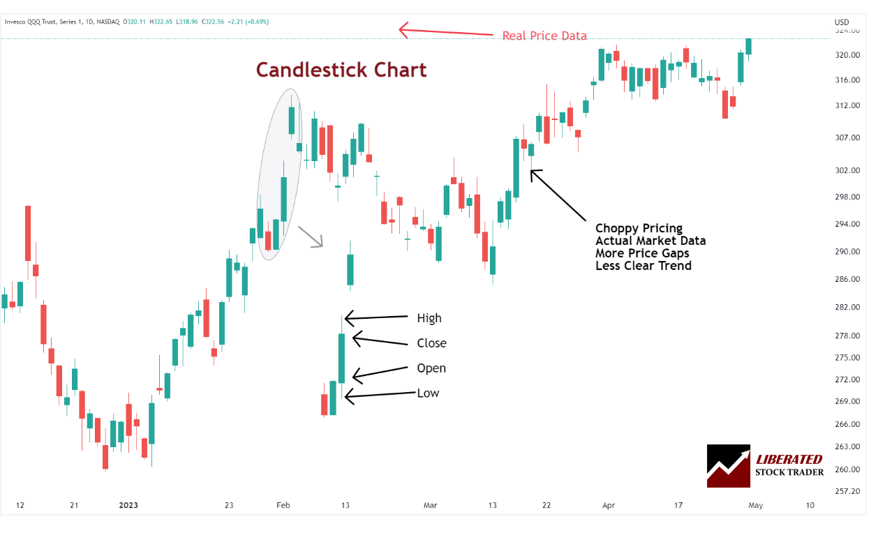
2. Candlestick Charts
Candlestick charts are among the most popular types among traders. They use “candles” or bars to indicate changes in price movement over time. Each candle contains four pieces of information: the opening, closing, high, and low prices for the period.
Get Candlestick Charts on TradingView
Candles with a long body indicate strong buying or selling pressure, while those with a short body signify more consolidation or indecision. Candlestick charts provide traders with a wealth of information and are often used to identify trend reversals, as well as support and resistance levels.
3. Kagi Charts
Kagi charts can help traders identify support and resistance levels more accurately than standard candlestick charts. This is because Kagi charts display lines that only change direction after a large, specified price move occurs. This allows traders to focus on important price changes rather than being overwhelmed by the noise of small, daily fluctuations in the market.
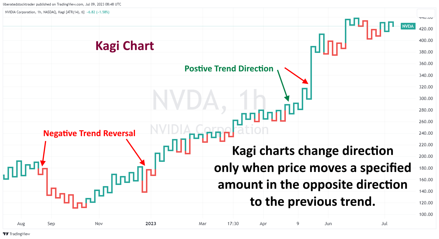
Get Kagi Charts on TradingView
Additionally, Kagi charts are useful for identifying entry and exit points, as they provide clear indications of trend reversals when combined with support and resistance levels. Additionally, Kagi charts leave out all minor price movements, which can help traders identify larger trends that may have been missed during smaller time frames.
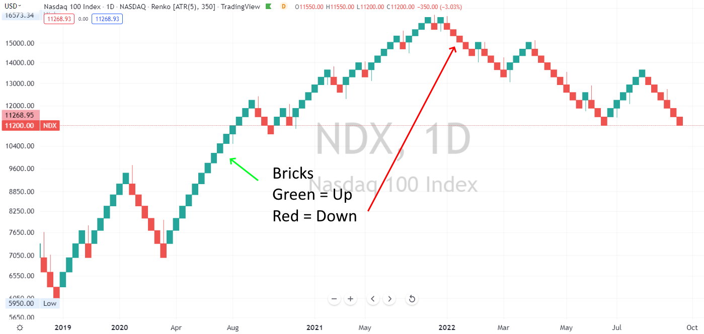
4. Renko Charts
The Renko chart is composed of bricks, or boxes, that indicate a change in price movement. If the security moves up by a pre-defined amount, it will form a solid green brick; if the security drops by the same amount, it will form a solid red brick.
Get Renko Charts on TradingView
Renko charts are a great alternative to traditional bar and candlestick charts, as they enable traders to easily identify breakouts or trend reversals. Each brick represents a fixed value, allowing traders to quickly identify support and resistance levels, rather than relying on the compression of prices that accompanies smaller time frames. This makes Renko charts an ideal tool for analyzing large market movements, which can be difficult to identify with more traditional chart formats.
Renko charts are particularly useful for day traders who require reliable indicators to make educated transaction decisions. Moreover, Renko charts offer more flexibility than Kagi charts, as traders can use their own criteria to determine the size of each box and the length of each trend line.
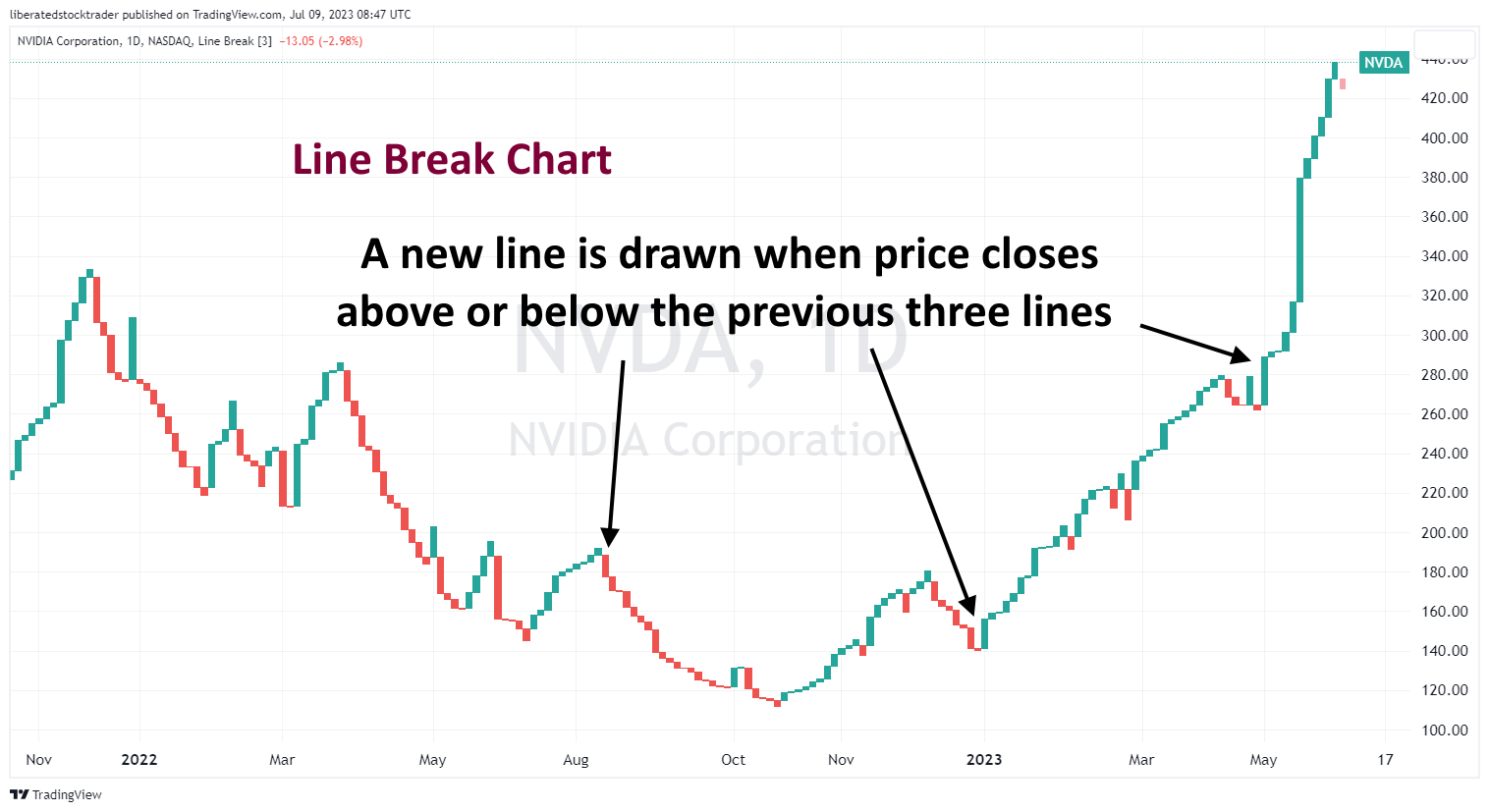
5. Line Break Charts
Line break charts are similar to Renko charts in that they use boxes, or “lines,” to track changes in price movement. The difference is that line break charts can have multiple lines or boxes per trend change, whereas Renko charts typically have only one.
Get Line Break Charts on TradingView
Line break charts are also useful for traders who wish to identify breakout points and potential reversal points in the market. Furthermore, they can provide a more detailed trend analysis than traditional chart formats. Line break charts also offer flexibility when adjusting the size and length of each trend line.
Unlike Renko charts, line break charts require more data points before a box is drawn, making them less suitable for day trading strategies. However, longer-term traders may find line break charts more useful, as they identify entry and exit points more effectively than other chart formats.
6. Point & Figure Charts
Point & figure charts have been around for centuries and are still widely used by technical traders today. These charts use X’s and O’s to indicate price movements. Xs indicate rising prices, and Os stand for falling prices.
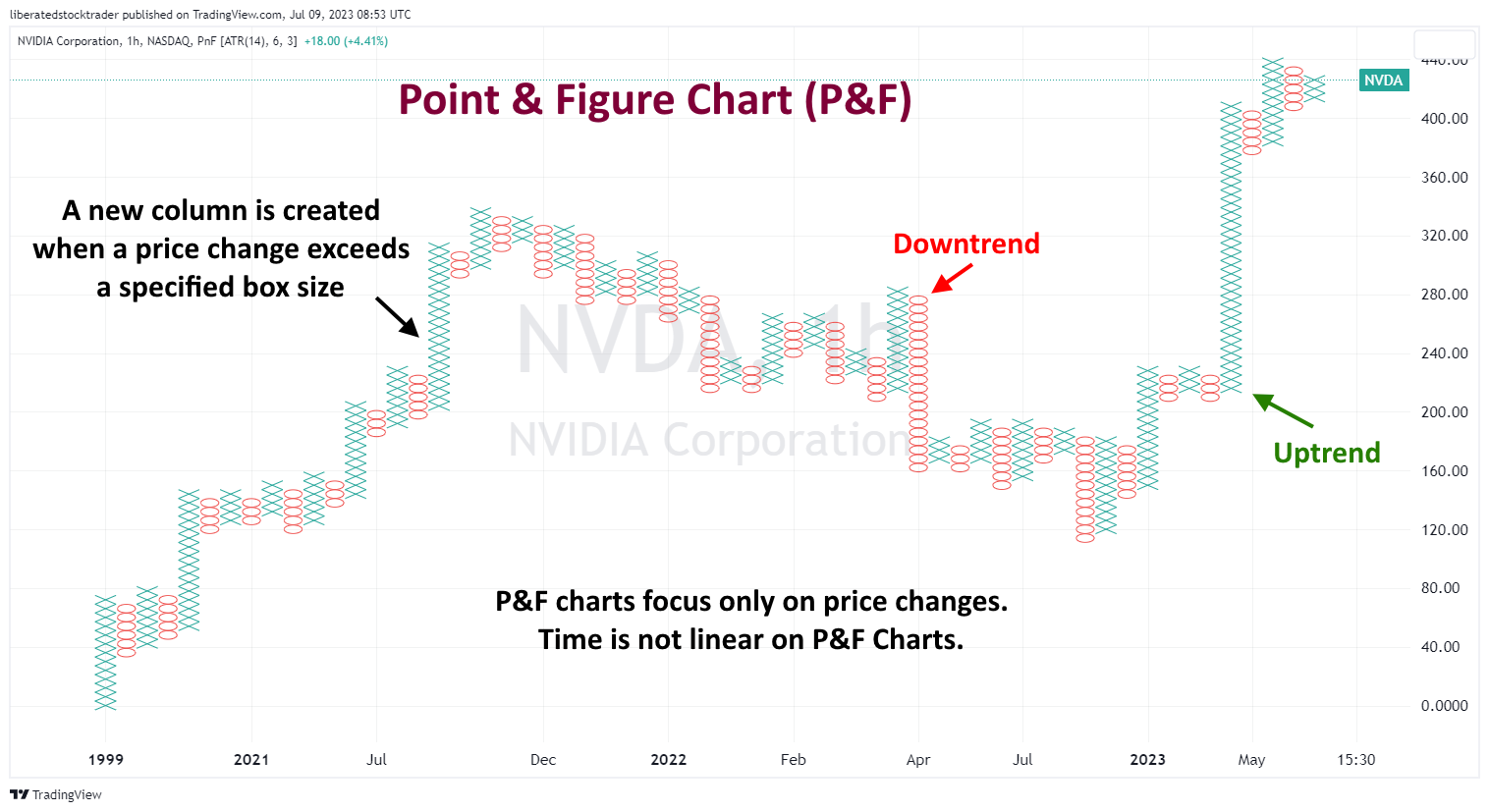
Point-and-figure charts plot the direction of prices over a specific period, but they do not account for the passage of time. They show price movement in one direction or another, making them useful for identifying support and resistance levels and trends.
Point-and-figure charts are based on price movements rather than time intervals like bar or candlestick charts. They depict a running total of the number of points the stock has moved, either up or down.
FAQ
What is Equivolume charting?
Equivolume charting is a trading technique that combines volume and price data into each bar or candle. This allows traders to see important changes in price and volume on one chart. Equivolume distorts the standard timeline on charts with its focus on volume.
Why did traders shift away from Equivolume charting?
As technology advanced, backtesting proved Equivolume's inadequacy, and trading platforms shifted away from it toward more sophisticated options like Heikin Ashi or Japanese candlestick charts. This made equivolume much less popular and useful.
What type of data does Equivolume provide?
Equivolume charts display a combination of price movement and the total number of points moved, either up or down. These charts also convey the highs and lows of trading for a given period. This data helps traders compare buying pressure (up volume) to selling pressure (down volume). The comparison can then gain insight into market sentiment or momentum.
What technical indicators work with Equivolume?
Very few indicators work with equivolume because of the limited data this charting type provides. Oscillator-based indicators like Stochastics and MACD can be used to analyze equivolume charts. However, volume is not a major factor in interpreting these oscillators' readings.
Should I use an Equivolume chart in my trading?
No, based on our testing, we would not recommend using equivolume charts as your primary trading tool. Equivolume charts provide limited information and are completely unproven with modern backtesting systems. No major stock market software supports equivolume for backtesting, forecasting, or pattern recognition, so we advise avoiding it.
Are there limitations to using an Equivolume chart?
Yes, price and volume information is based only on price movements rather than time intervals, so they are not useful when analyzing trends, patterns, or reversals.
Is there any other type of chart that provides similar information?
Point & figure charts are similar to equivolume charts in that they base their calculations solely on changes in stock prices. These charts differ from equivolume by emphasizing major shifts in stock prices rather than volume fluctuations.
What does Heikin Ashi have to do with Equivolume?
Heikin Ashi has no relation to equivolume charts. Heikin Ashi is a form of charting used for technical analysis that filters out volatility and noise from traditional candlestick charts to make trends easier to identify. This chart type can be especially useful in spotting trends in an otherwise choppy market.
What charts are better than Equivolume?
We have proven the best charts are Heikin Ashi, Candlesticks, Renko, Line Break, and Raindrop charts. These charts are proven by data to improve trading performance and are elegant implementations of supply and demand in the financial markets.
The Demise of Equivolume
Equivolume charting was once modern but is now outdated. Trading platforms have shifted away from Equivolume charts toward better options, such as Heikin Ashi or candlestick charts. As a result, Equivolume charting is no longer a widely used technique.
You want to be a successful stock investor but don’t know where to start.
Learning stock market investing on your own can be overwhelming. There’s so much information out there, and it’s hard to know what’s true and what’s not.

Liberated Stock Trader Pro Investing Course
Our pro investing classes are the perfect way to learn stock investing. You will learn everything you need to know about financial analysis, charts, stock screening, and portfolio building so you can start building wealth today.
★ 16 Hours of Video Lessons + eBook ★
★ Complete Financial Analysis Lessons ★
★ 6 Proven Investing Strategies ★
★ Professional Grade Stock Chart Analysis Classes ★