Liberated Stock Trader Pro Investing Mastery Program
Master the Stock Market and Build Real Financial Freedom
Even if you’re starting from scratch, you can learn to invest confidently and grow your wealth — without hype, guesswork, or overpriced gurus.
Learn from a Certified Financial Expert
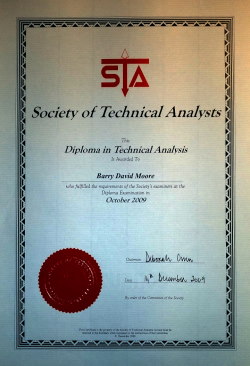
Meet your instructor: Barry D. Moore (CFTe) – a globally Certified Financial Technician accredited by the International Federation of Technical Analysts. Barry isn’t just a casual trader; he’s a seasoned market analyst with over two decades of experience.
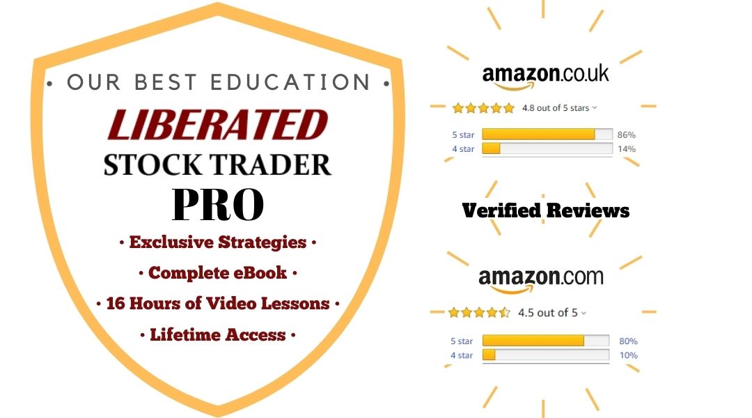
Since founding LiberatedStockTrader.com in 2010, Barry has helped over 40,000 people learn to invest wisely and take control of their financial future. He is also the author of the Amazon 5-star-rated book The Liberated Stock Trader (included with this course) and has developed multiple high-performing investing strategies.
Barry’s professional certification and real-world experience ensure that you will receive time-tested techniques and factual knowledge, not fluff or risky gimmicks.
Barry’s teaching style is down-to-earth and clear, making complex concepts easy to grasp. He is dedicated to your success– ready to guide you through challenges, answer your questions (yes, you can chat with him live!), and ensure you truly master the material.
What Our Students Are Saying
Don’t just take our word for it – hear from real students who have transformed their investing using the Liberated Stock Trader methods:
“The Liberated Stock Trader is a superb educational tool to learn and hone your skills in the world of stock trading and investments. I found the entire program exceptionally straightforward to use, with good explanations of how the market system works.
Every chapter is succinct and very effective in showing new and experienced investors how to leverage the stock market and succeed. Additionally, the market analysis tools are superb and greatly expand your skills to develop a diverse portfolio.
Keep up the great work!”
– Commander Kirk S. Lippold, USN (Ret.) – (Amazon Review)
“All I ever thought about trading changed when I started this course. I was surprised at how simple it was for me to understand! It covers everything from fundamental analysis to technical analysis and more. Barry is gifted at teaching complex ideas in a clear way. It’s the handbook every investor should have!”
– Tom, (Amazon Review)
“As a newish investor, I was unclear on evaluating and understanding what a stock chart was saying and the implications of emerging patterns. This book and the accompanying online tutorial helped me to grasp many elements of this process. Combining this technical information with chapters on the fundamental analysis made a total story.” – Jean C. (Amazon Review)
What You Will Learn
By the end of the Liberated Stock Trader Mastery Program, you’ll have the skills and knowledge to invest like a pro. Here’s my introduction to each of the 17 course modules.
What’s Inside the Mastery Program?
You get a complete stock market education package that equips you with both the knowledge and practical skills to excel. Everything you need is included – no extra purchases or costly add-ons. Here’s what you’ll receive in the Liberated Stock Trader Mastery Program:
Why Choose This Program Over Others?
Ready to Transform Your Financial Future?
You’ve read about what’s possible – now it’s time to act. Don’t let hesitation hold you back from financial freedom. Every day you wait is a day you could have started growing your wealth and skills. The stock market won’t wait, and neither should you! Your journey to financial mastery starts today.
 Buy Now Only $499; It’s a Great Investment